
Boosters caused the Omicron outbreak
A simple mathematical model explains the spread of the Omicron variant


Short summary void of math
Boosters were a prerequisite for the Omicron outbreak of 2022.
My statistical model predicts the variant’s spread with 99.96% accuracy over a period of 39 weeks by assuming Omicron could have always existed, but was highly unlikely to ever be sequenced before boosters were administered.
Summary
I present epidemiological evidence that administration of booster doses was a prerequisite for the Omicron outbreak of 2022, which caused more than 300 million infections.
A simple statistical model that is unaware of index cases explains the direct monocausal relationship between number of boosters administered and proportion of sequenced SARS-COV-2 samples that found Omicron.
The Gompertz growth constant of the Omicron variant is a linear function of the proportion of people who received a booster dose of a COVID-19 modRNA vaccine (p<10^-65, Adjusted R-Squared 0.9996).
Vaccination data released by 'Our World in Data' suffer from delays caused by bundled release of accumulated data which distorts the temporal relation between the booster campaign and the Omicron outbreak.
I need your support
You can support me with a subscription to my newsletter while I dedicate day and night to become a better investigative data journalist. United we stand. Divided we fall.
Introduction
In a recent article I discussed German excess mortality figures. I not only found out that peaks in excess mortality are preceded by peaks in SARS-CoV-2 infections, but that every peak in booster administrations was followed by a peak in SARS-CoV-2 infections 13 weeks later which is represented by a peak in the NUMDAYS variable in VAERS reports around 94 days post-injection when the search is limited to patients who received a booster dose and suffered a SARS-COV-2 infection.
To learn more about how boosters relate to infections I started looking at data supplied by 'Our World in Data'. My initial idea was to perform a simple linear regression analysis on two time series:
New boosters (independent variable, shifted by 13 weeks)
New Omicron cases (dependent variable)
Due to the low (biweekly) resolution of the data that describes Omicron’s proportion among worldwide sequencing results, I tried constructing a generalized logistic function that describes Omicron’s journey from a single case to making up nearly 100% of all sequenced SARS-CoV-2 samples.
My inability to determine the growth constant of Omicron made me realize that the growth constant of Omicron is a linear function of the number of monovalent boosters that have been administered.
I will explain how I reached this conclusion throughout the following pages.
Methods
Because my original intention was not to create a statistical model that explains how Omicron came to be the dominant SARS-CoV-2 variant, the result section illustrates the path towards my discovery in a chronological manner.
Every image is accompanied by an explanation of the steps taken.
I wrote my code for NodeJS and used LibreOffice as charting software. Curve fitting was done manually.
The JavaScript code can be downloaded from my website. All time series that I acquired or calculated for this article are available in both JSON and CSV format.
Data Sources
Downloads
Results
1. Determining daily new Omicron cases

Data for new COVID-19 cases is supplied by 'Our World in Data'. It consists of one data point per day for a total of 1096 days, starting on January 1st 2020.
We are only interested in the period of time starting July 1st 2021, since boosters were not yet widely deployed in the middle of 2021 and Omicron took ahold in early 2022.

These are all registered cases between July 1st 2021 and December 31st 2022. To subtract all cases caused by other variants we will have to figure out what proportion of cases were attributed to Omicron.
Fortunately, 'Our World in Data' supplies this information for 249 regions. Data for the entire world is not available. The data points for case proportions attributable to Omicron are spaced 14 days apart.
I am constructing a graph that represents the average proportion of sequences that found the Omicron variant amongst all sequenced samples across all 249 countries that 'Our World in Data' supplies data for.
2. Constructing a graph to represent Omicron’s dominance over other variants

This is a graph based on figures from 'Our World in Data' representing Omicron’s expansion in biweekly resolution.
All we have to do is multiply the graphs from Figure 2 and Figure 3.
Alas the resolution of the variant data supplied is very low with only 1 data point every 14 days, while there is 1 data point per day for new cases.
To still be able to multiply the graphs, I either have to reduce the resolution of daily new cases to represent biweekly new cases or construct my own graph that represents the share of Omicron cases in daily resolution.
I choose the latter.
3. The Gompertz function won’t fit
The graph describing Omicron’s share of SARS-CoV-2 sequencing results is shaped like a sigmoid curve. The wikipedia article for sigmoid curves leads to another article about a special sigmoid function called the Gompertz function, which is commonly used to describe population growth in biological systems.
The Gompertz curve or Gompertz function [...] is a sigmoid function which describes growth as being slowest at the start and end of a given time period. The right-side or future value asymptote of the function is approached much more gradually by the curve than the left-side or lower valued asymptote.So after reading the wikipedia articles I gained a rough idea about sigmoid functions. I constructed a very simple function with two parameters and optimized the input values.

This is not the graph we are looking for. However, we are having a closer look at the formula to understand what is going on.

There are two input parameters:
k = 0.098 (Growth constant)t0 = 693 (Day of index case)
The result is dissatisfying because the exponential growth is too fast during the initial phase. No way of changing our input parameters can improve the result any further.
Even if we shifted the graph to the left by picking a different day for the index case, we would have to decrease the growth rate to fit the phase of exponential growth, which would result in lower growth and reaching maximum dominance much later.
Let’s recall what Wikipedia had to say about Gompertz functions:
The right-side or future value asymptote of the function is approached much more gradually by the curve than the left-side or lower valued asymptote.When looking at how the proportion of sequences that were Omicron changed over time, it doesn’t seem like its dominance can be represented by a Gompertz function at all.
The expansion of Omicron’s dominance seems to be slower during the accelerative phase than during the decelerative phase.
4. Omicron’s growth constant is not constant
The slow initial growth of Omicron could be explained if the growth constant for Omicron was not constant, but increased over time. If immunological reactions to booster administrations were causing pressure for SARS-CoV-2 to adapt, then this might be what is facilitating Omicron’s expansion. Growth would be zero until the first boosters are administered.
This would solve two issues:
The slow initial spread could be matched more accurately
We eliminate the need to know the day the index case occured
So in order to create a new equation, we assume:
Omicron’s growth is positively correlated with the number of boostered people
When the number of boostered people is zero, Omicron’s growth is zero
There were unregistered Omicron infections before the variant had ever been sequenced
Instead of the two input parameters growth constant k and day of index case t0 the new input paramaters would be:
k (Growth constant)
b(x) (cumulative boosters administered per person up to day x)
I have my work cut out: I have to acquire a time series of the daily cumulative number of boosters administered worldwide. 'Our World in Data' supplies this variable.
5. Delays in booster data by 'Our World in Data'

This is the raw data for cumulative boosters administered worldwide supplied by 'Our World in Data' in daily resolution.
Look at the graph for a second. It does not look like a natural function. In case you can not see what is unusual about this graph, I created another chart displaying the same data.
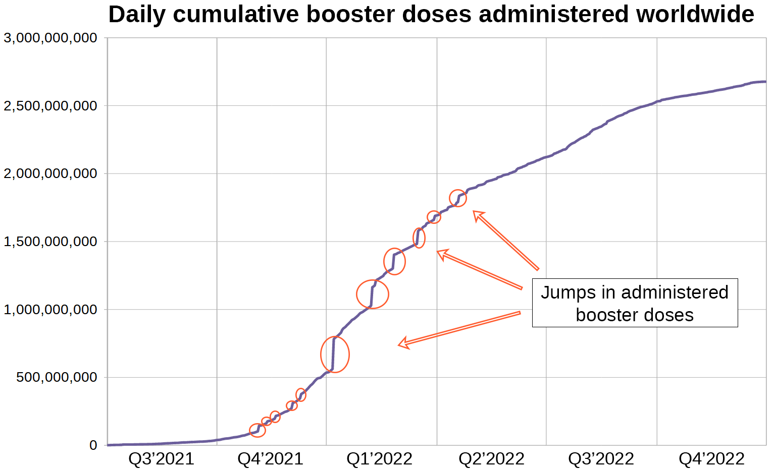
When data from more than 200 countries are bundled into one time series, I expect the resulting graph to be smooth. This one however has steps in it reflecting large numbers of dose administrations being reported on certain days.
In order to get a better picture I decided to plot the daily number of administered boosters. A time series of this variable can easily be derived from the cumulative number of boosters administered per day.

In the three weeks leading up to January 8th 5.9 million boosters were being administered per day, but on January 8th the number jumped to 218.3 million according to 'Our World in Data'.
I consider it highly unlikely for the rate of booster administrations to increase by a factor of over 30 within a day at the height of the booster campaign and conclude that the data supplied by 'Our World in Data' does not accurately represent the number of boosters administered per day.
The flaws in OWID’s dataset are easily explained:
Some countries (like Germany) report their administered doses on a daily basis. These countries are represented by the continuous area at the bottom of the graph.
Other countries’ data are released by OWID in bundled form in irregular intervals. These countries are represented by the spikes in the graph.
The question remaining is when exactly the booster doses were administered, which we are going to figure out.
6. Correcting for the reporting lag

I don’t know if you can see it, but there are 3 distinct booster waves, each representing a booster campaign. I created 3 functions describing these booster campaigns and a 4th function that amounts to the sum of all 3 functions.

Booster campaign 1
t0 = 530k = 0.0147
Booster campaign 2
t0 = 860k = 0.0330
Booster campaign 3
t0 = 1018k = 0.0700
Filling in the input parameters and adding all 3 functions yields the following formula that can plotted onto a chart.
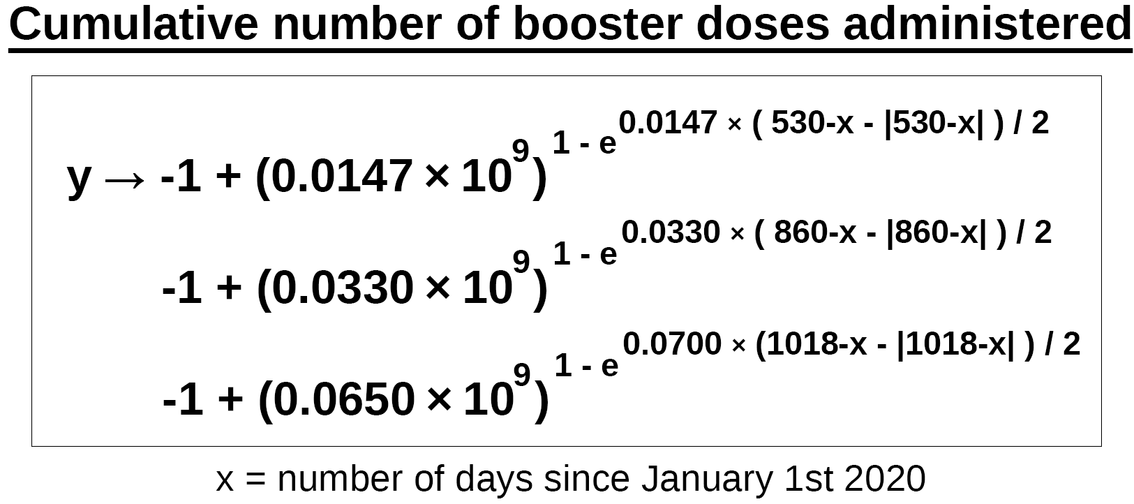

The black line is our function and represents the total cumulative number of booster doses administered worldwide. We can compare it to the raw data supplied by 'Our World in Data' now.

The black areas represent periods of time during which data accumulated without being released
The steps in the original graph represent days on which accumulated data was released
We can also calculate the daily number of boosters that were administered from the corrected version and compare it to the one calculated from the original data.

The corrected red graph runs parallel to those countries that reported their administered doses daily, but most of the spikes are located to the right of the graph’s first peak.
It looks as if vaccinations that should have occured towards the end of 2021 at the height of the vaccination campaign were moved into 2022.
We are going to use the corrected version to construct our sigmoid function.
7. Constructing the sigmoid function

This was my first attempt to construct a function that was meant to express Omicron’s expansion as a Gompertz curve.
The function fails because Omicron’s growth parameter is scaling with the number of administered boosters, while a Gompertz function’s growth parameter is constant.
My basic idea is to remove the need to specify the day of the index case as starting point of Omicron’s spread and replace it with the proportion of boostered people.

I have already determined the cumulative number of boosters that were administered globally, so all that remains to be done is figuring out the value of the growth constant k by fitting the curve to the biweekly data from 'Our World in Data' representing the proportion of SARS-CoV-2 sequencing results that found Omicron.
Since 'Our World in Data' only supplies biweekly data for the sequencing results, we will have to take snapshots of our function on the days for which 'Our World in Data' reports the proportion of sequencing results. The reporting begins on July 15th 2021 and is followed by one data point every 14 days.
I have performed this operation and found Omicron’s growth constant at 1 booster per person on the planet to be 0.0533.
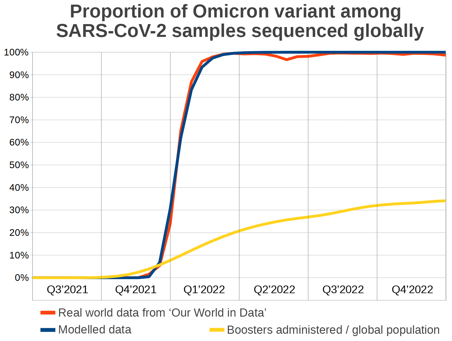
I ran a simple linear regression analysis on the two time series representing modelled and real world data respectively, spanning over 39 data points each.
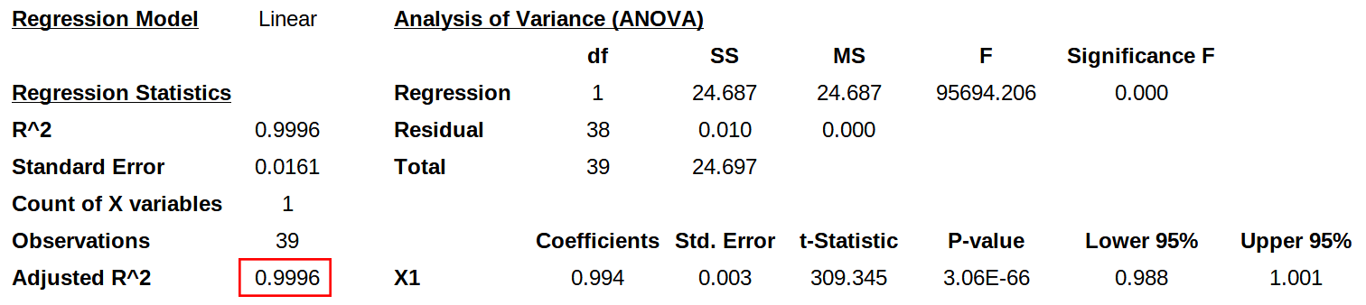
R-Squared is 0.9996 which means our modelled graph fits the real world data almost perfectly.
Conclusion
Because Omicron’s growth constant is a function that returns zero unless boosters were administered, our newly developed model does not require awareness of the point in time when the index case occurred, which makes it superior to previous models that attempted to explain how Omicron became the dominant SARS-CoV-2 variant.
The model assumes that Omicron’s index case has always potentially existed due to the unstable nature of the SARS-CoV-2 genome, but Omicron was not favored by the laws of thermodynamics and immunology until immune pressure was introduced by the boosters.
Geert Vanden Bossche explained the responsible mechanisms in great detail in his video “5 past 12”.
What’s next?
Description of the Delta variant’s expansion as a modified Gompertz function with a function of fully vaccinated individuals as its growth constant
Description of the XBB variant’s expansion as a modified Gompertz function with a function of bivalently boosted individuals as its growth constant
Further Investigation of the flaws in the data supplied Our World in Data
Extra like for the "What's next?" section. It is easy to overfit some model to data, and hard to assess stability of the model.
If boosters caused Omicron, and Omicron elbowed the deadlier strains away, it sounds like boosters may have actually been good for something. I'm a pureblood, getting any of these jabs was clearly stupid, from the beginning, and I'm supposedly in a risk group at 72. And it remains to be seen where Omicron goes from here, we could end up with a virulent strain. And the jabs may have made serial infections the norm for many. So, not saying either the jabs or Omicron are good, it's just hard to miss that one possible silver lining.