
COMPROMISED - Part 1
This might not sit well — but it needs to be said.


Introduction
I know from experience how painful it is to feel unmoored from reality. Many of you have spent years trying to see through the lies, to map the agendas behind the narrative of our time, and — ultimately — to understand why 25 million people had to die.
About a fifth of those 25 million suffocated in the most inhumane way: In isolation, feeling neglected by those they loved, and by those who were supposed to care for them professionally.
The responsible entities remain untouched by justice. It is up to us to change that.
For the longest time, nothing made sense. The pieces were there, but the picture never formed — just a blur of pain and doubt. I didn’t know what was real. But every lie uncovered lit a small path forward. So I followed it.
I can’t promise everything will make sense by the end of this series — but I’ve done my best to put things back in order. A lot of the questions that have remained unanswered or unasked will have answers that are satisfying to even the most curious and the most critical thinkers among you. And those that I can not tackle, will be open to either experimental research or criminal investigation.
So if you still long for that feeling — that reality is something we can mostly agree on — then you're going to have to let go of some beliefs you might still be clinging to.
You’re gonna need the strength it takes to admit you were wrong.
I was wrong about (almost) everything
By the end of 2024, I thought my journey was over. I had convinced myself I understood what had happened. Fooled myself into thinking I was done with COVID.
Asking questions had already cost me my marriage, my friends, and at times, my sanity. When Steve Kirsch (we will get to him) invited me for an interview about my statistical analysis of the U.S. death wave in the summer of 2021, I felt something like closure. A sense of accomplishment. I had done enough.
I thought I’d cleared the fog. But I had only added to it.
I didn’t mean to mislead. I was trying to help. But I steered us further from the truth — and I own that.
I’m afraid the same can’t be said for everyone.
When I first told Michael Yeadon that Denis Rancourt had deceived us, his reaction was immediate:
“That’s how I know you’re lying.”
To him, doubt itself was betrayal. He didn’t ask me what I meant. Didn’t ask for evidence. Just shut it down. Keep that in mind when it comes to Michael ‘Pfizer’ Yeadon.
If that’s your reaction too, you might want to stop reading now. I’m not here to argue, and I’m not here for accusations. I’m here to tear your heroes down and show you how you were lied to. Take it or leave it.
The Call
“Just when I thought I was out, they pull me back in”
In December 2024, I was invited to yet another conference call hosted by a group of German academics called “7 Argumente”. Just to be clear: I’m not an academic. I’m a bipolar underachiever — a mailman, a dish dog, just another n… nobody really – a nobody obsessed with justice. I don’t belong in that circle. However, since I started writing about vaccine harm, all kinds of people — millionaires, billionaires, trillion-dollar traders, professors and otherwise achieved career-driven types of people — started reaching out. Most offered money, jobs or other kinds of help.
For the record: I don’t take money from anyone – not anymore I don’t. I survive on government support — just enough for food and smokes. Besides, the offers became a lot more sparse as I closed in on the cause for these 30mio. excess deaths. In fact, nobody’s offered me help in a long time. Most of the people who used to offer help don’t even reply to my messages anymore, but they all listen when I have something to say. They listen and observe quietly, because these spineless cowards are a lot more scared of us than we should ever have been scared of them.
And they should be.
Back to the call. Marcel Bartz was presenting his findings on German excess mortality — which, however well-intended, are in a class of their own in terms of self-deception. He was supported by a shady character operating under the pseudonym “Ulf Lorré,” who through his expertise as an electrical engineer seemed to be offering me help in my latest studies, but in retrospect gave me information and advice, that led me further off course. It was only when I cut my ties to him that I managed to connect the dots.
[corrected from: an electrical engineer claiming to be firmly convinced that electromagnetic waves have no impact on health]
Be very skeptical of anything he tells you.
During the call, someone asked whether Denis Rancourt’s work was solid enough to be shared without damaging credibility. Out of respect for Marcel and Ulf, I gave a diplomatic answer:
“I’ll write you an email after the call.”
I already knew something was off with Rancourt’s methods — I had tried desperately to estimate the vaccine’s impact on mortality myself, without success. There was no clean positive correlation to be found. Not across countries and not across jurisdictions of any country that I looked at. The correlations are negative across the board. Any analysis concluding vaccines meant net harm to population health would require complex modelling.
So how was Rancourt producing these bold, clear-cut claims?
I couldn’t just tell these people “Denis Rancourt is full of shit” without doing the work. Due diligence had to be done. Even if my sentiment was likely true.
So painful as it was - I flew over his final paper on vaccine-related mortality – a steaming pile of shit stacked 521 pages high. Surprisingly – thank God! - it took a mere five to ten minutes to spot the fraud. It took another 3000 hours to make sense of it, but we are gonna get to that part later. First, let’s take a closer look at his sciency science paper that is oh-so-very sciency.
Denis Rancourt’s Deception
Let’s get right to it. This chart (Fig 52, page 277) and an array of others like it are at the core of Rancourt’s claim that there is a causal link between vaccinations and excess mortality.

To the untrained eye — and even to many trained ones — the chart looks persuasive.
High correlation. Linear slope. Data points across countries.
The message is clear: the more vaccines a country gave, the more people died.
But it’s a trick.
Rancourt plotted total excess deaths per country on the y-axis, and total vaccine doses administered per country on the x-axis — without adjusting either for population size.
He was using “non-standardized” variables.
Let that sink in.
It’s not excess deaths per capita vs. doses per capita.
It’s number of excess deaths vs. number of doses.
It’s like plotting “annual toilet paper sales” against “annual marriages” and calling it causality — all you’re measuring is population size. Slightly more obvious in this example, because I believe neither the number of defecations a person dedicates time to throughout a day nor the amount of paper used per sitting has an impact on the likelihood for this person to become married. I hope we all agree on this.
It’s no surprise that the U.S. and Brazil are in the top-right — they have huge populations.
It’s no surprise that smaller countries are clustered in the bottom-left — they don’t have tens of millions of people to die, or hundreds of millions of vaccinees to administer doses to.
Bigger countries do more of everything. Eating, defecating, dying, getting vaccinated. The more people there are, the more people will have comitted time to these activities by the end of the year.
This is not science.
It’s narrative engineering through the art of statistical deception.
The Chart Part
I know a lot of you hate this stuff, so I’ll keep it brief. I’m afraid it’s important we do this, so I can show you, that it’s not just a few charts on pages 277ff that are affected, but that his entire publication has been adjusted to make the deception possible.
I thank Christian Meyer for this contribution. If you don’t know who he is, I urge you to look into his Substack. It might not always shine through his brief articles, but he’s probably the most brilliant person on this platform. Whenever I need a second opinion on anything numbers-related, I ask him.
First, we replicate Rancourt’s chart, using numbers from his pdf’s appendices where possible, while filling in what’s missing from World in Data. This is what we get:
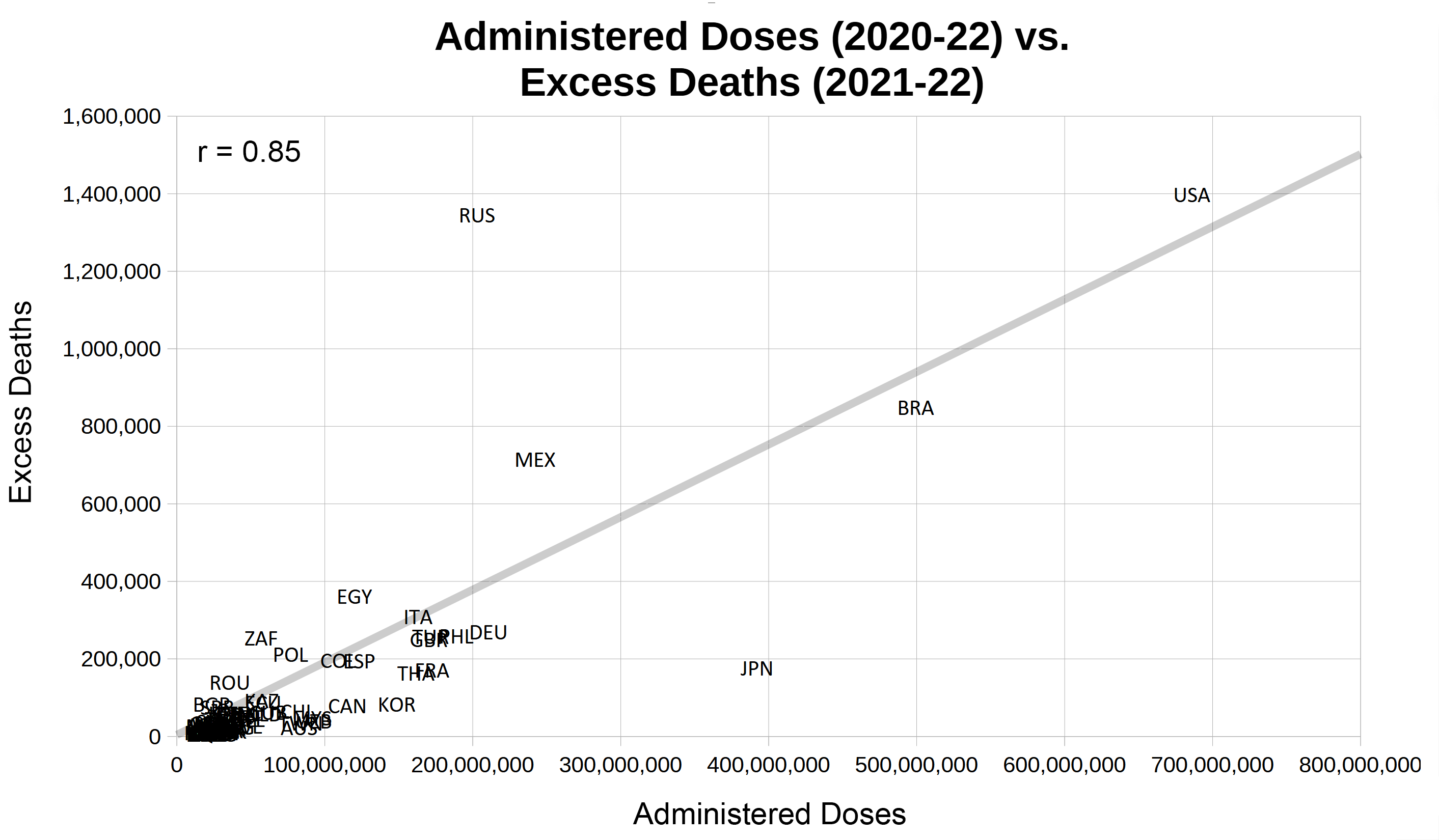
And the result looks a lot like the fraudulent chart by Rancourt et al. Russia, Japan, Brazil, Mexico and the USA are in the same spots relative to the chart area and the clustered nations. Our Pearson correlation coefficient is even slightly higher than his. I’m not sure why, but this is what I came up with. You can double-check the figures using the spreadsheet I am making available to you.
So much for the nonsense. Now we divide each country’s excess deaths and administered doses by the respective 2019 population estimate to get closer to a valid representation of the relationship.

Looks different, huh? Inverted even. Trust me when I say: I am not here to make a case for these rotten gene shots. I am not. But we should at least consider this: Some substances can elicit effects that will improve your chance of survival in certain contexts, but can still kill you or be detrimental to your overall health. This is a lot more common than you might think.
But whether or not these ungodly concoctions improved chances for survival upon exposure to some noxious agent and what the nature of this noxious agent might be is not what I am talking about today. We will take this one step at a time. So please be patient.
The Issue with “Large Countries”
Page 14 has a short paragraph on what countries were excluded from analysis.

“Large countries” were excluded. Interesting. Statements like these are tell-tale signs for the type of statistical deception employed by Rancourt, Hickey and Linard – using non-standardized variables. Instead of going through lengthy explanations, let’s just look at what Rancourt’s charts would look like if he had indeed included “large countries”.
The large countries I am adding are China, India, Indonesia, Pakistan, Nigeria, Ethiopia, Democratic Republic of Congo, Tanzania and Kenya, i.e. all the ones explicitly named by Rancourt et crooks, plus the 5 largest African countries by population. None of these data are unavailable or even remotely difficult to acquire. You can grab the three csv files from World in Data (vaccinations_global.csv, population.zip, number-of-deaths-per-year.zip). So the alleged “lack of available data” was just another lie - a necessary one.

Yeah, I know, it looks odd. The USA are relatively small next to India. If these crooks had included India and China, people would have surely been more likely to notice the fraud.
Fraud. That’s what it is. The 3 authors - Denis G. Rancourt, Joseph Hickey and Christian Linard – are clearly guilty of misleading their readers through the extremely bold use of statistical trickery.
I hate to ruin someone’s reputation. I really do. Not only did I keep this information private for half a year, but I also immediately contacted the authors and offered them a way out of their misery, promising them I had no intention to harm their reputation in any way, sincerely so.
A First Hint at Military Involvement
The first person I contacted was Denis Rancourt. His reaction was to immediately go offline on both Telegram and Substack simultaneously. He probably pulled the cable in panic. That’s what it looked like to me anyway. I apparently triggered a “fight or flight” reaction – and when it comes to his type, you know what the choice is gonna be when those are the only two options.
It took a full five hours for him to come back online and block me. I can only imagine what happened in the meantime (e.g. he might’ve asked the money man for support), because shortly thereafter my local network devices found themselves under attack. All three connected devices were compromised. My network security had already improved since the first government-resistance-related attack in late May of 2024 and has improved further since the day I contacted Rancourt, but at the time it didn’t take much to invade my network, especially not with Telegram running on each of my devices. Telegram hands your conversations to the enemy gift-wrapped. It’s free, unlimited, and tailor-made to lure in government critics and more likely than not contains at least one backdoor at any given point in time.
I started tcpdumping all traffic when I realized this was happening, but I’m probably never gonna take the time look into that data, since I doubt it’ll amount to much useful information.
What’s fascinating about this incident is, that I offered Denis a way to get out of this, without me writing about him. My offer was for him to talk to me about it and then cooperate to turn this into something good, something positive. Regardless of what species an animal belongs to, I am firm believer that strength comes from cooperation, not from shooting each other down.
Yet he didn’t really seem to consider me a threat to his reputation. This confused me profoundly. But then again, he wasn’t a teacher anymore. His career is a thing of the past.
His two co-authors Joseph Hickey and Christian Linard however were not done with their careers. They were still teaching at university. And there are few threats that are greater to an academic’s reputation than being rightfully accused of scientific misconduct.
So, I’d probably have more luck addressing these two. “They probably weren’t even aware of how Denis had abused their trust.” I thought in my naïvety.
Yet, I received no reply from them at all. I called their offices in Canada a number of times, but never got a call back. They didn’t seem concerned at all.
Joseph Hickey and Christian Linard either do not care about their careers as academics or they know there is an entity shielding them from harm in exchange for their service – the service being their names under this 521 page long piece of misinformation.
To be continued…
 | A guest post by
|
One of the main reasons I paused posting on my blog is my embarrassment with the sphere I found myself in, including the insane authors, dishonesty and more. I felt like the truth was drowning in the torrent of lying, attention-seeking, and money-grift.
I don’t know who this author is. They fraudulently added my name as coauthor, which I have removed.
I haven’t even read it. I’m busy.
Thanks,
Mike