USA Preview: Select cause excess mortality
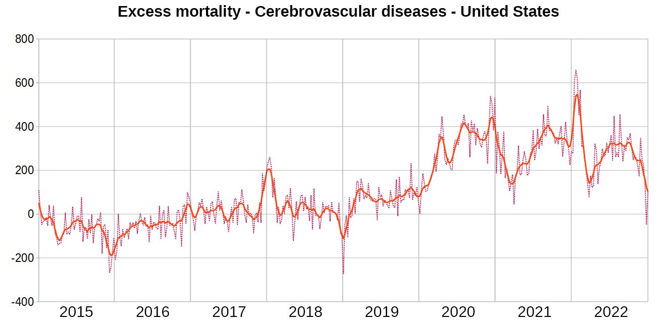
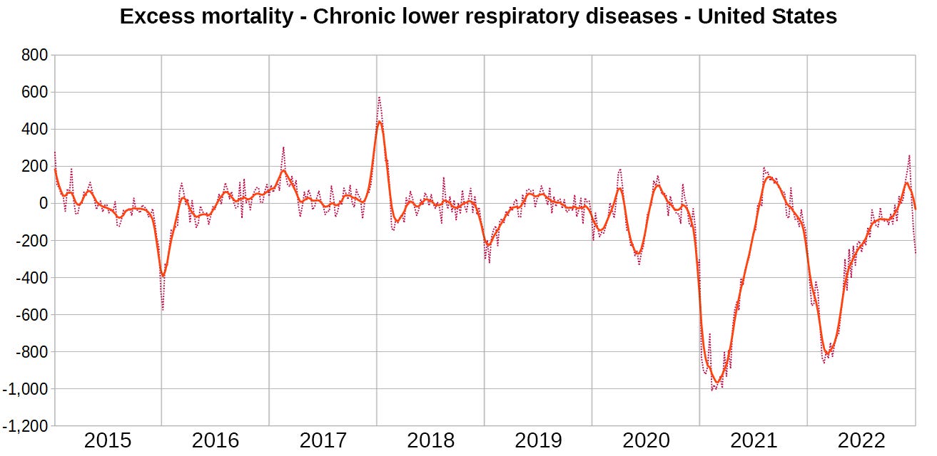
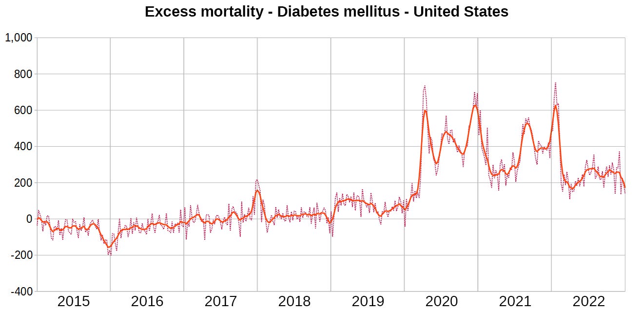
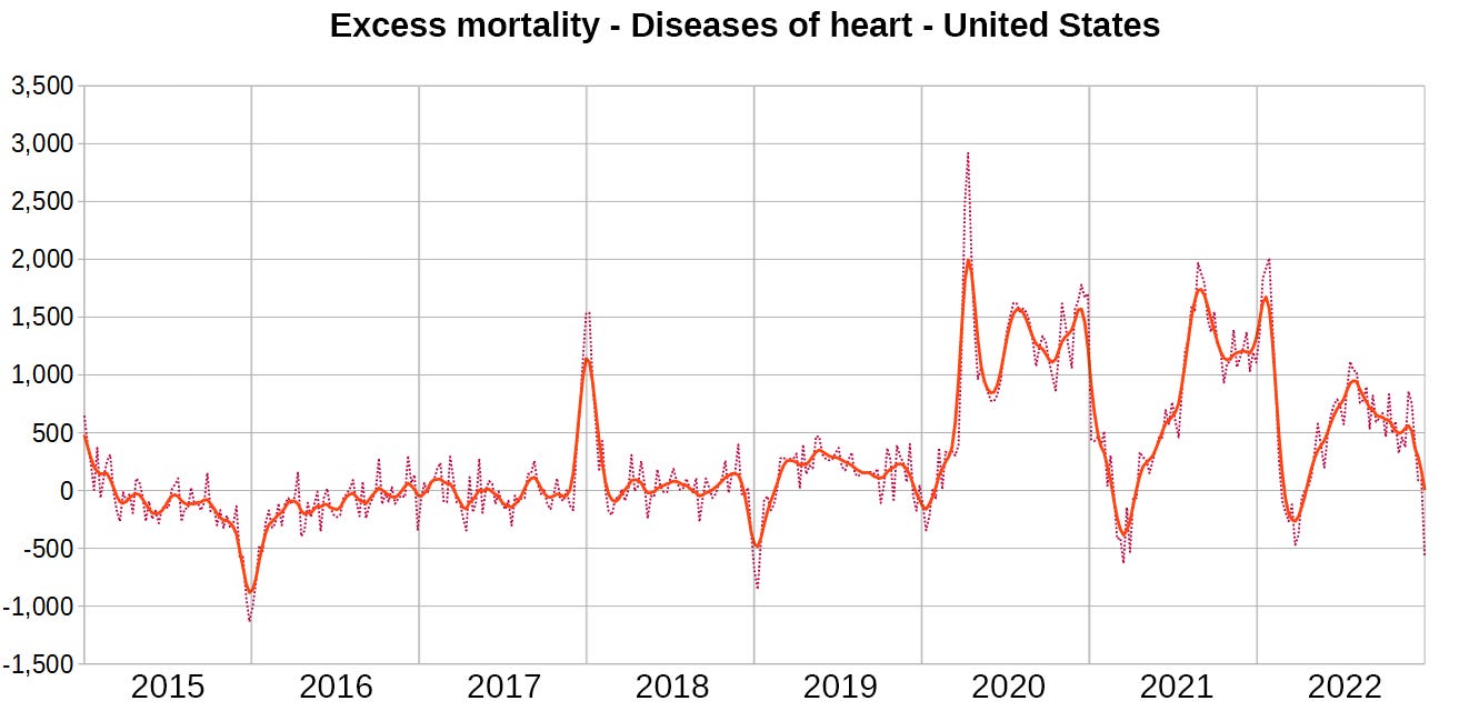
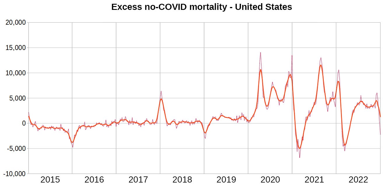
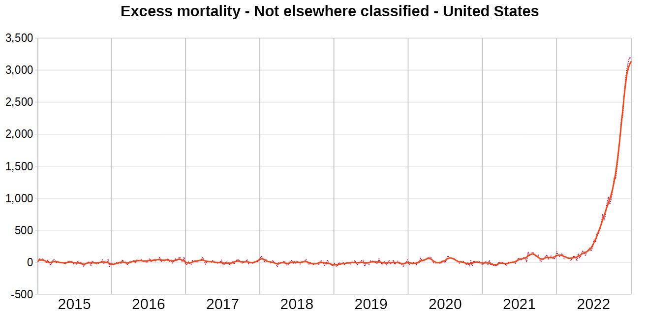
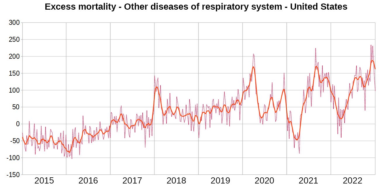
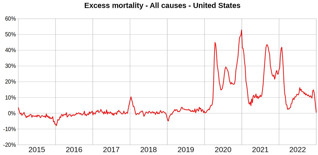
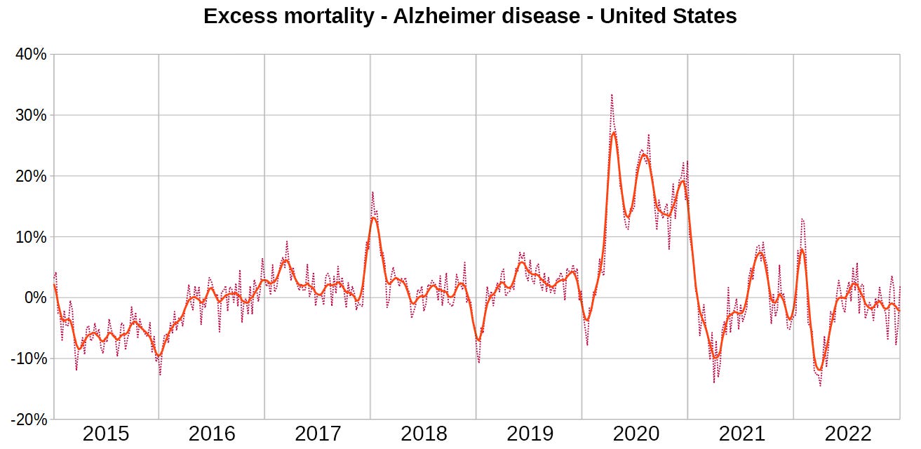
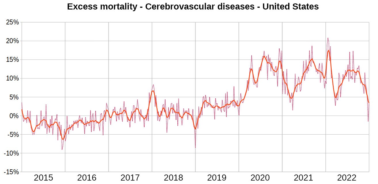
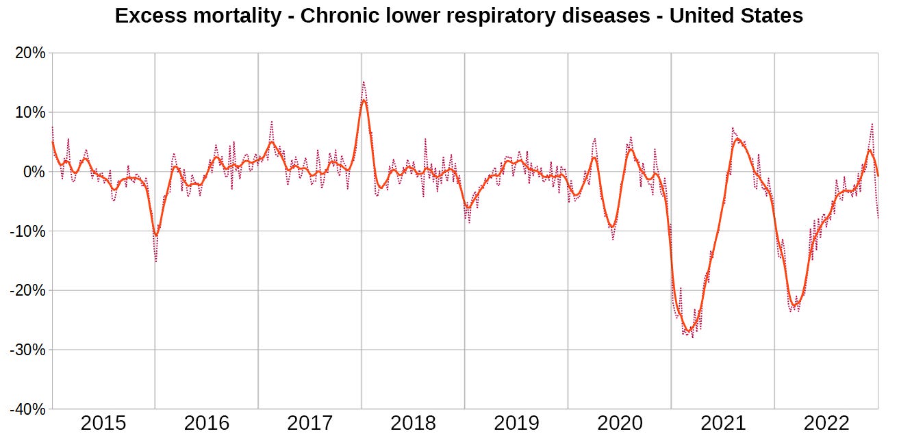
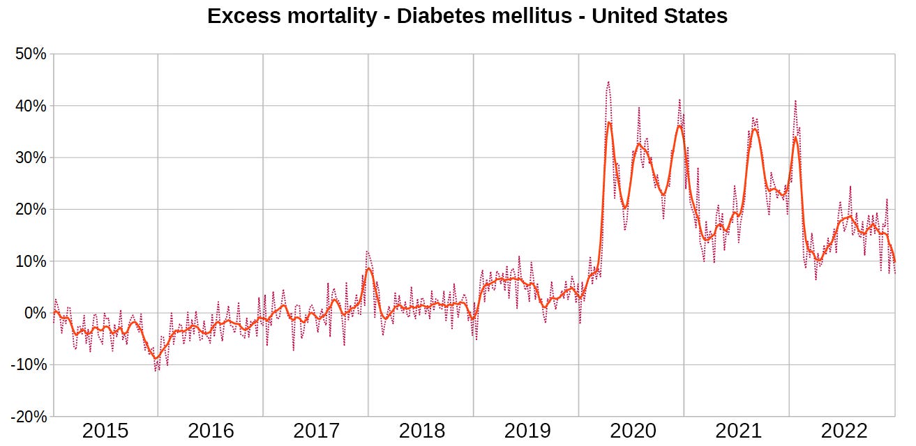
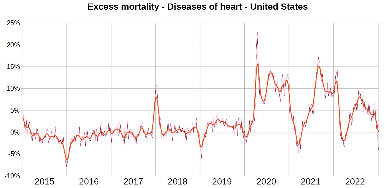
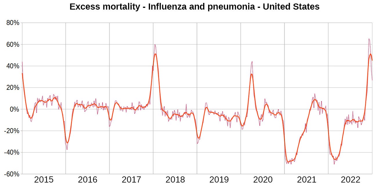
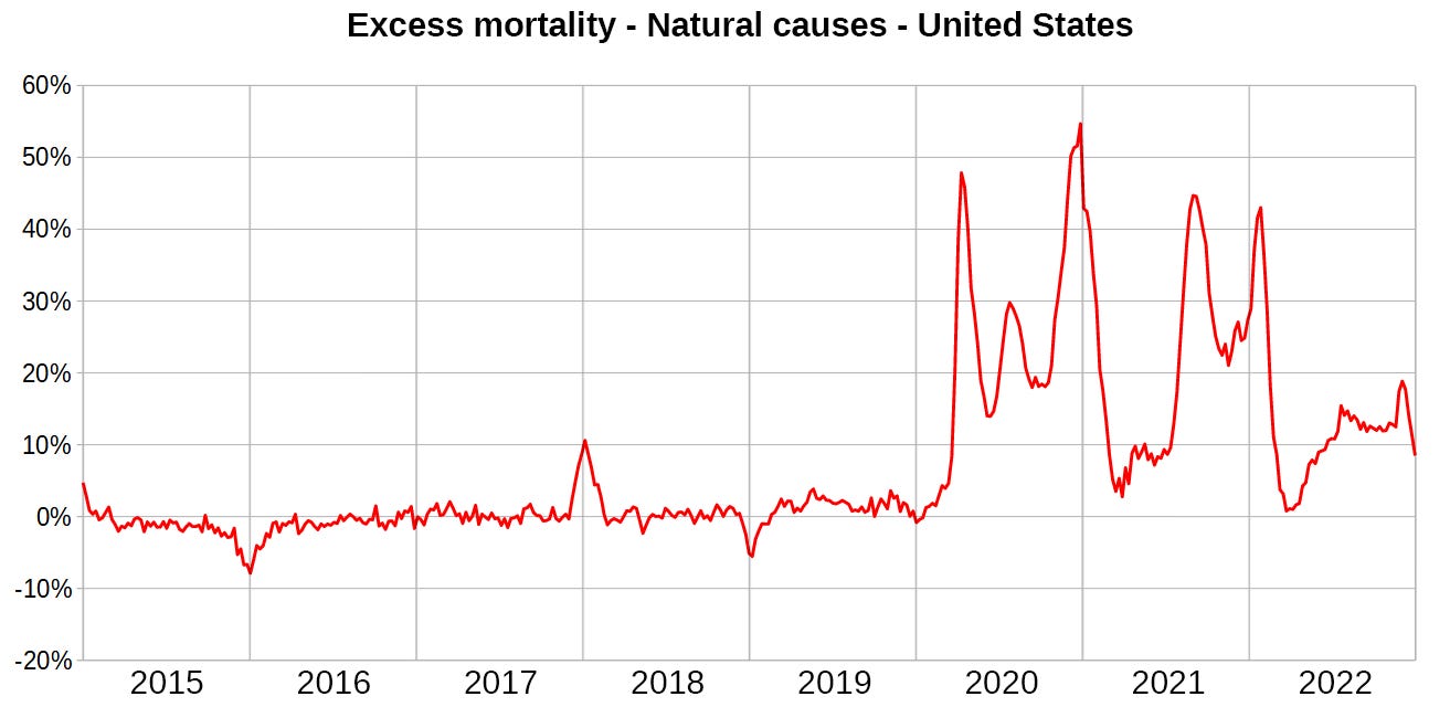
Select cause excess mortality since 2015 based on weekly population estimates
Introduction
Here comes another short preview into my work with the US data.
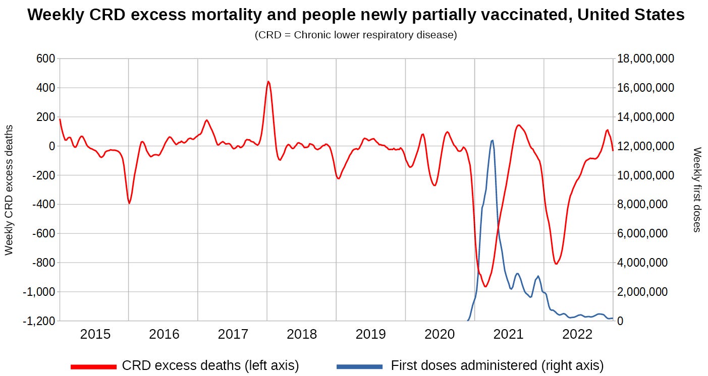
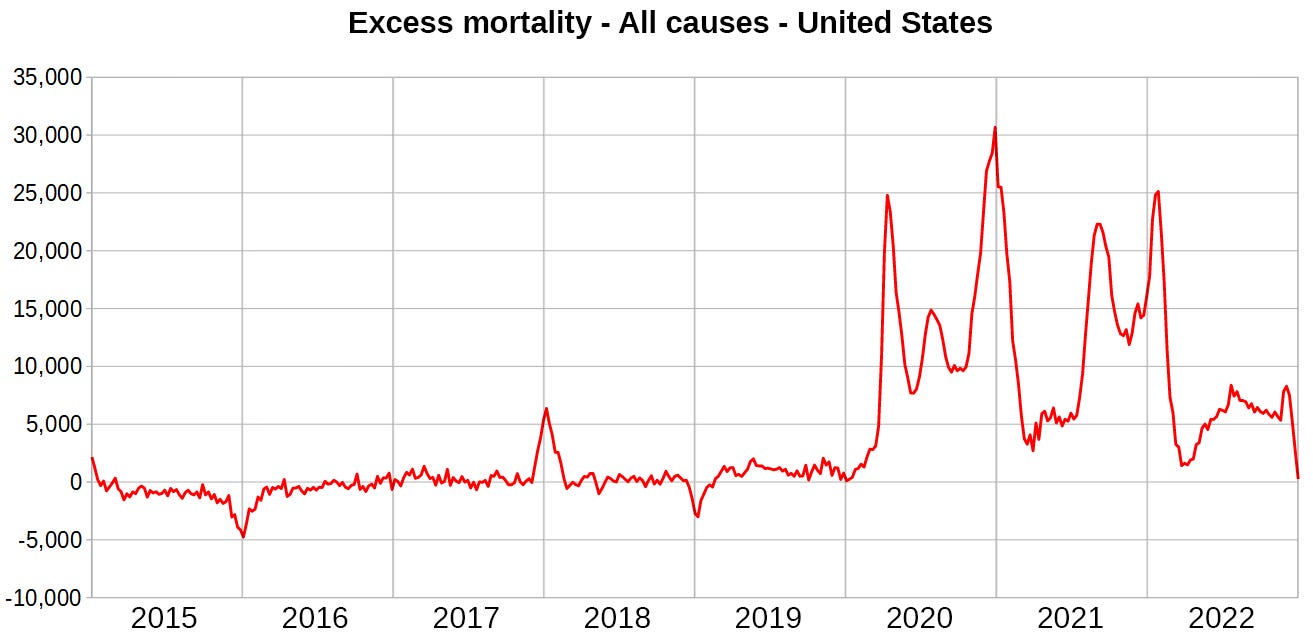
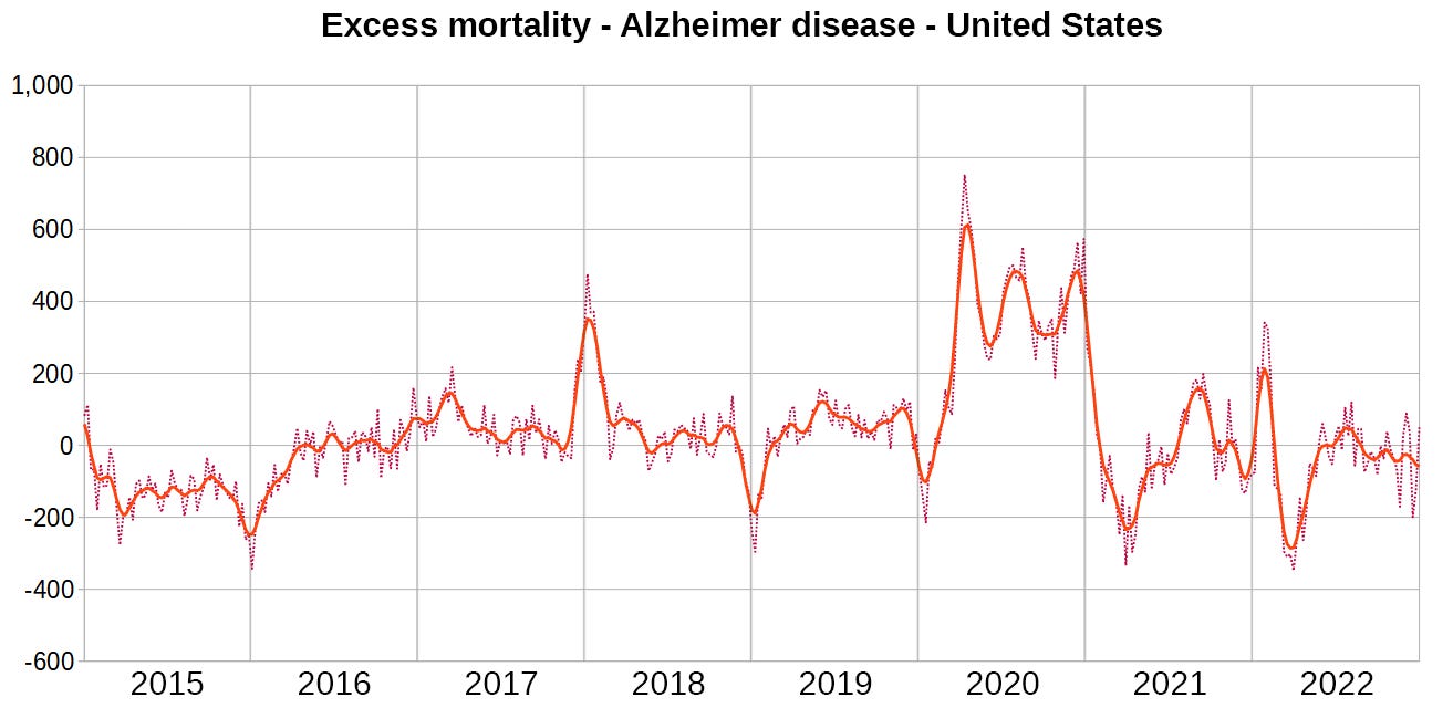
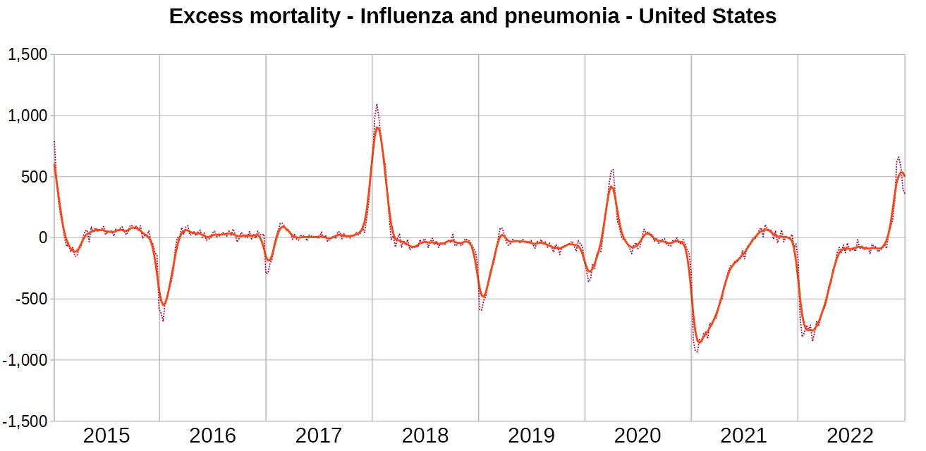
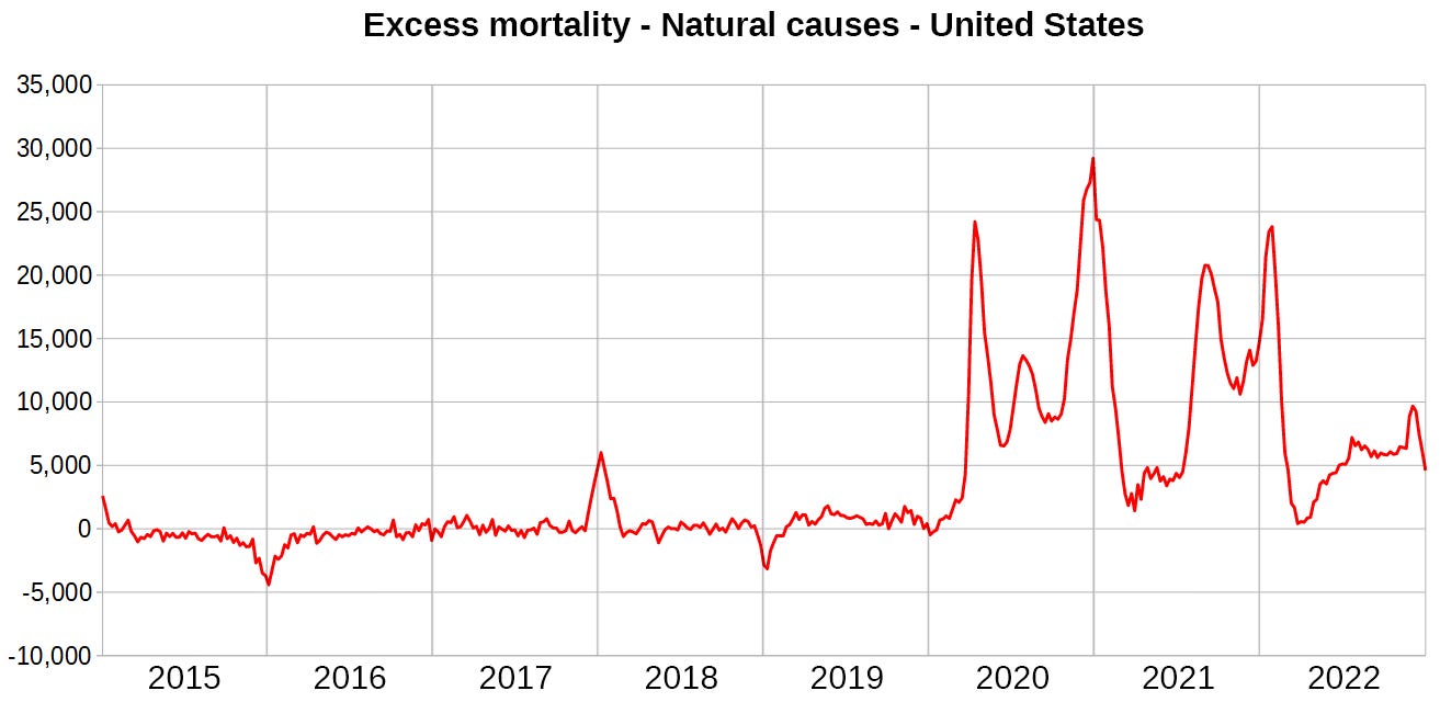
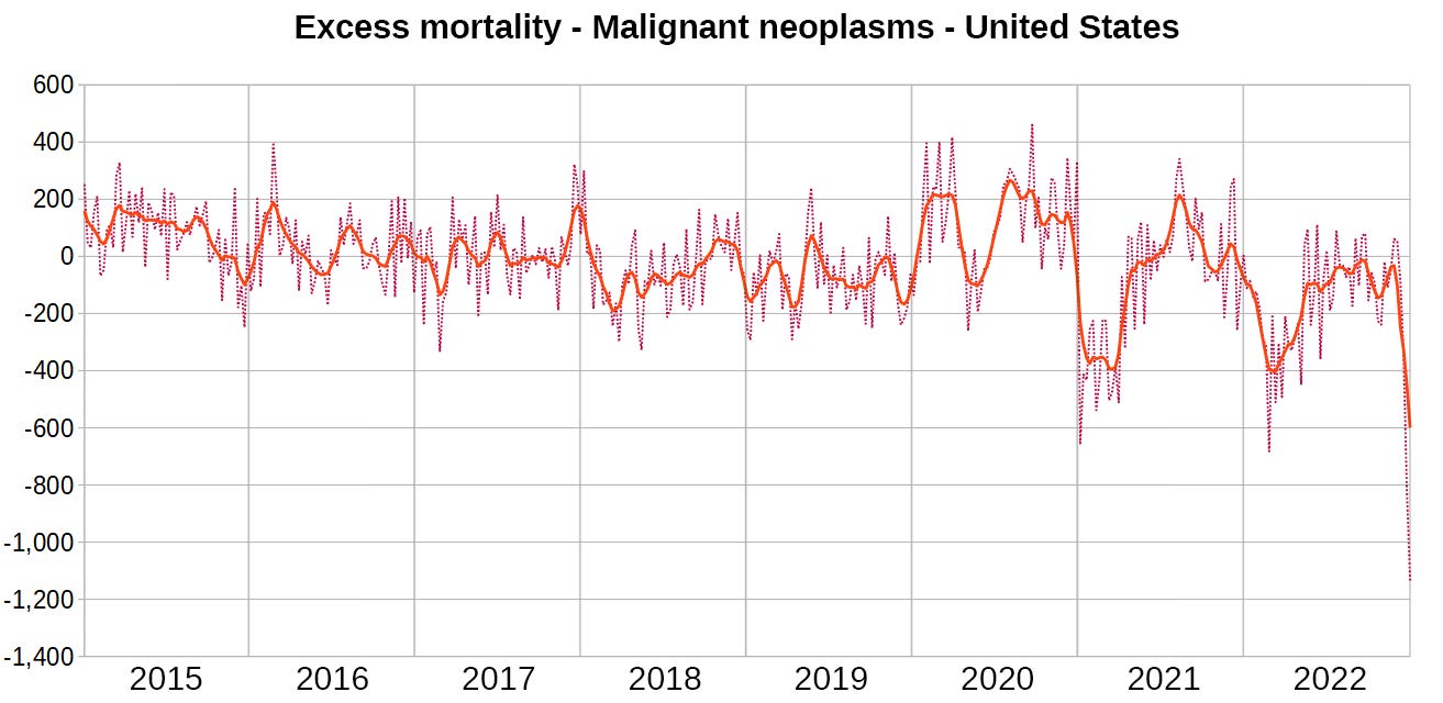
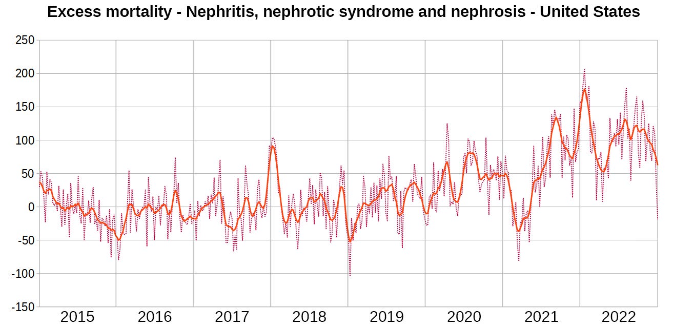
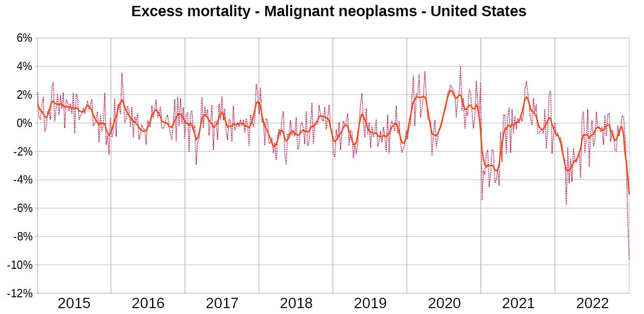
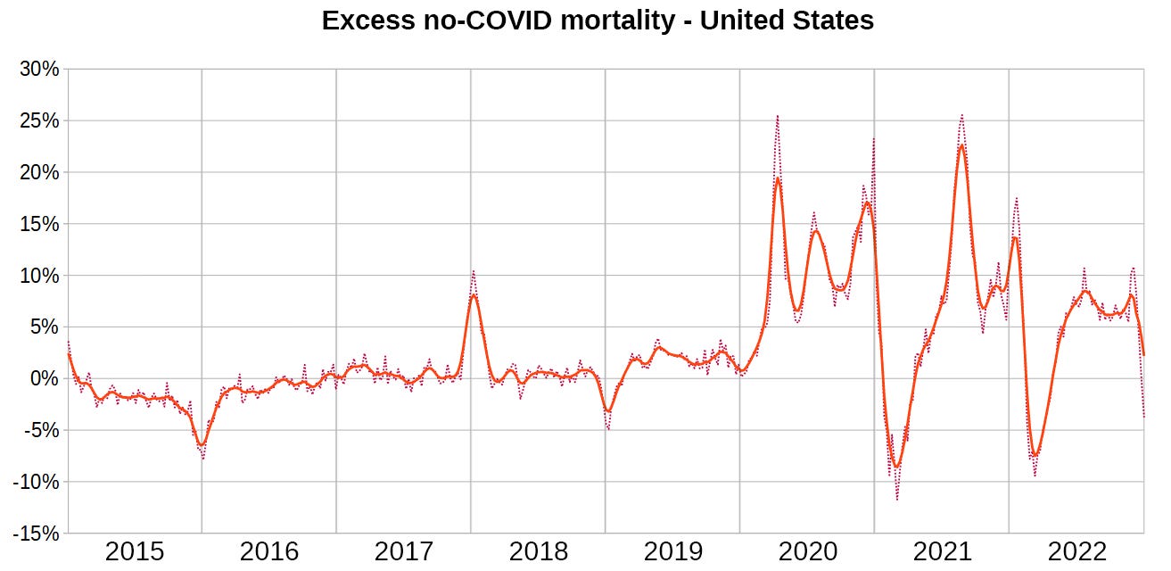
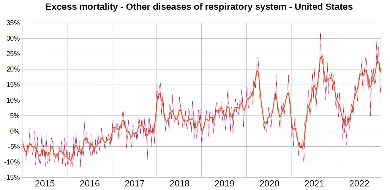
I am presenting charts for select cause excess mortality. I found some of these highly interesting, especially those related to respiratory disease.
Methods
I am using weekly population estimates to calculate deaths per population from which I then derive select cause excess mortality. The method was described in the last USA Preview article.
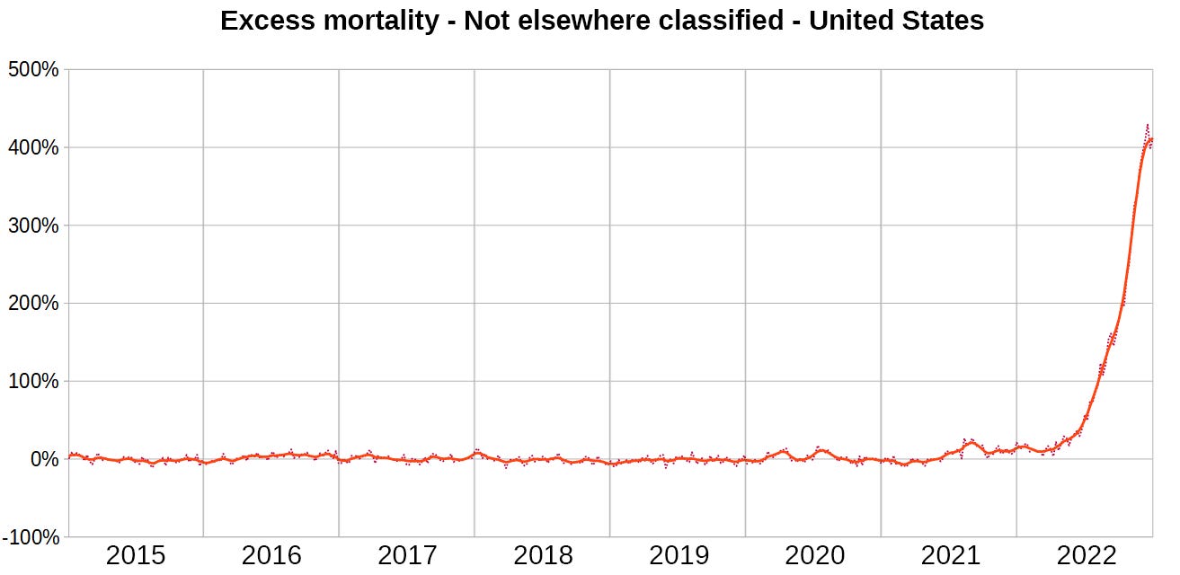
Deaths labelled “not elsewhere classified” have not yet been assigned specific causes. Most of them will eventually be removed from this category.
There are charts for:
Absolute excess mortality (2015-2019 average weekly deaths per pop are subtracted from weekly deaths per pop and the result is multiplied by the population size)
Relative excess mortality (weekly deaths per pop are divided by 2015-2019 average weekly deaths per pop)
Excess Deaths absolute
Excess Deaths relative
Closing words
I can display monthly charts up to 2021 for all ICD-10 diagnoses, stratified by age and gender. If there is anything specific you’d like to see let me know.
Special requests
This was requested by Geoff Pain.


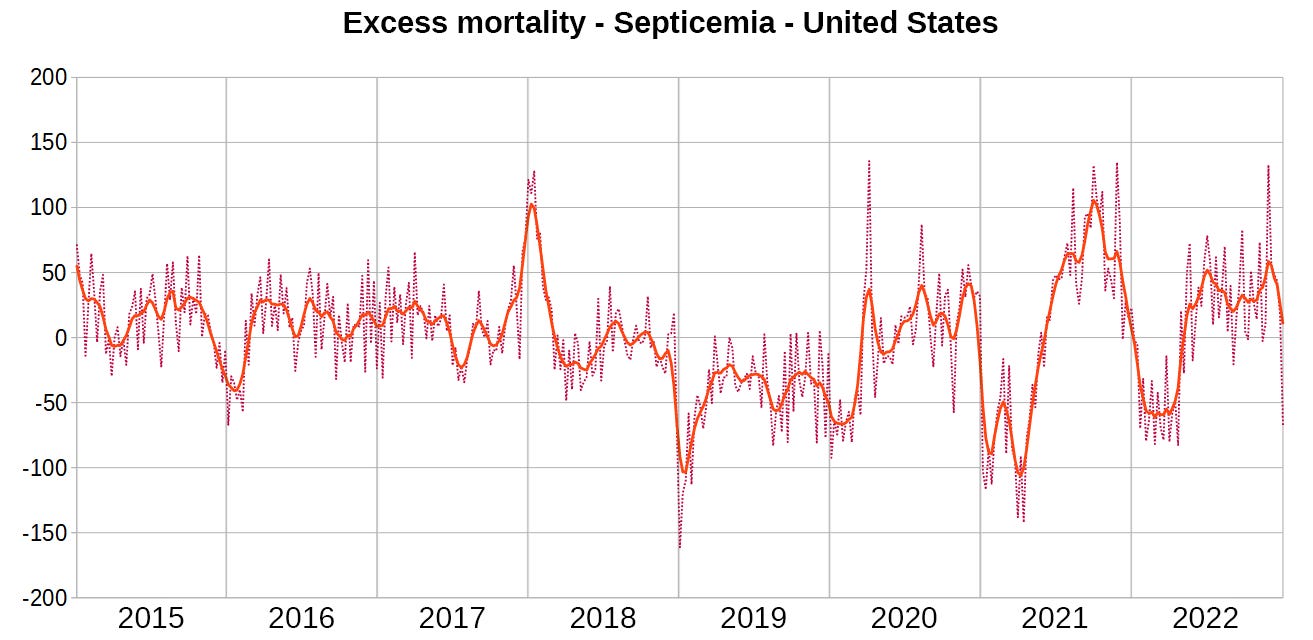

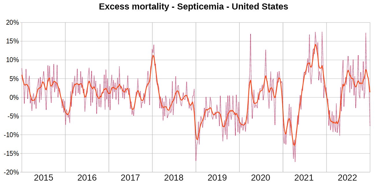
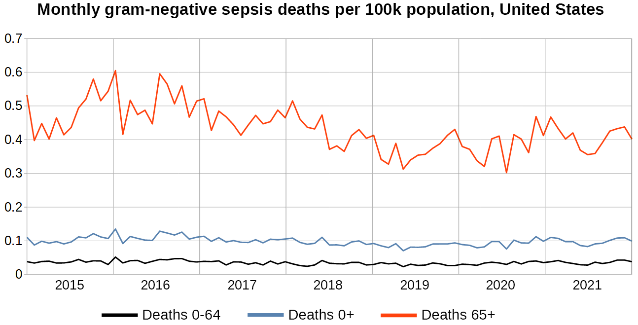
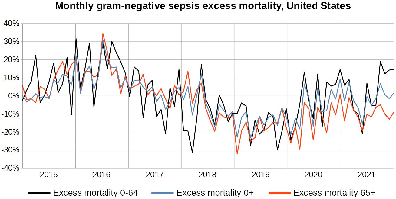
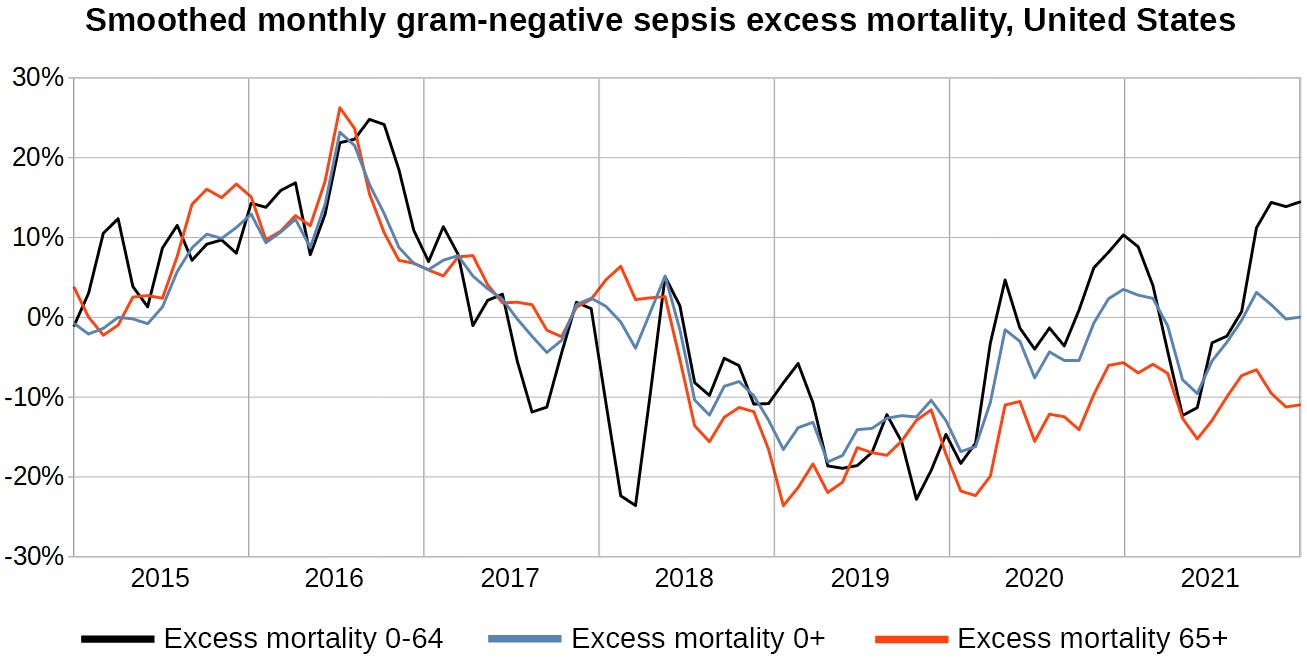
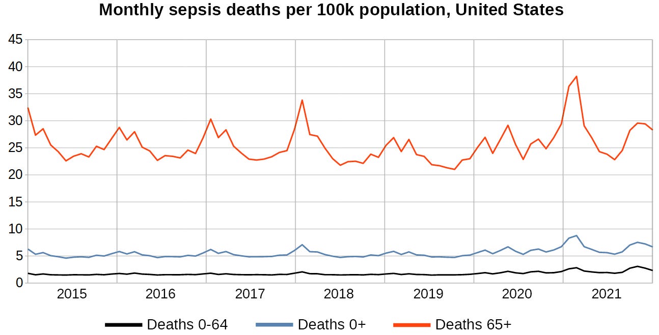
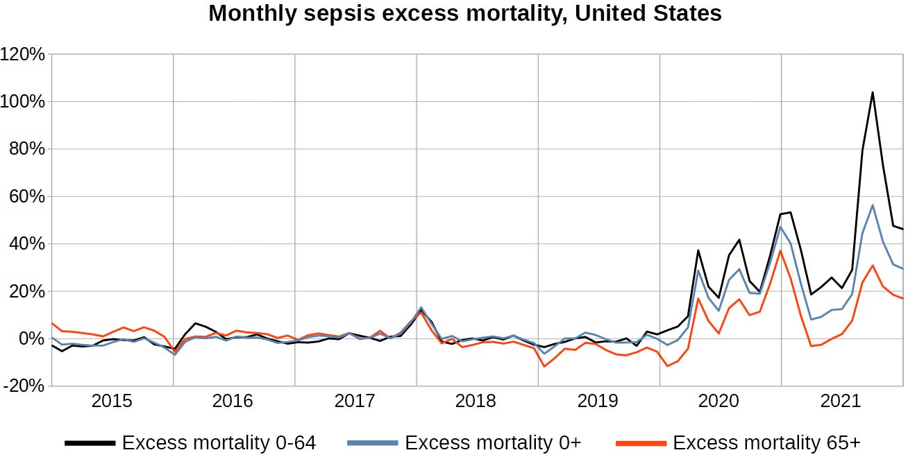
I am interested in Septicemia because Endotoxins in the jabs from E Coli used in production of mRNA jabs are known to carry through to each vial and will produce the same "Septicemia" symptoms as cases derived from actual bacterial infection. A cumulative graph might be useful. How were the Flu jabs in 2017 made?