U.S. Summer Deaths of 2021
COVID vaccinations in the summer of 2021 were associated with increases in COVID mortality across U.S. states.
Summary
This is an investigation into mortality trends across the USA during the COVID-19 era and the impact of COVID vaccines on these trends, with particular emphasis on the wave of death that sweeped over the country in the summer of 2021.
U.S. mortality figures were soaring throughout the entire 3-year period from 2020 through 2022, with mortality of external causes dominating the picture among children and young adults and COVID accounting for the largest share of excess deaths among higher age tiers.
While first dose coverage was found to be negatively correlated (p<0.001) with COVID mortality in all age tiers across U.S. states throughout the summer of 2021, these negative correlations appear to represent an efficacy illusion resulting from increased vaccination efforts in regions and age groups that entered the third quarter with low first dose coverage.
Per multivariate linear regression models, differences in COVID burden across U.S. states among adult age groups throughout July and August of 2021 are well-explained by first dose administration rates (p<10-10), but not by first dose coverage (p>0.1).
The time-order relationship between first dose administration rates and COVID mortality suggests a direct causal link from first dose administration towards COVID mortality due to vaccine-mediated infection enhancement occurring in individuals who became infected with SARS-CoV-2 delta variants within days of receiving their first dose in the second half of 2021.
Infection enhancement not only negatively affects disease outcomes and infectiousness on the individual level, but can also have profound effects on epidemic behaviour through its effect on transmission dynamics.
Multivariate regression models suggest that the COVID outbreaks observed globally during the second half of 2021, resulting in COVID-attributed deaths of 200,000 Americans and 800,000 Europeans across Iceland, Liechtenstein, Norway and the 27 EU countries, would have had minimal impact on morbidity and mortality, if first doses had not been administered while Delta variants enjoyed predominance.
Upon manifestation of the phenomenon in population-level data maintained by the CDC in mid-July of 2021, Director Wallensky’s dubbed the outbreak a “Pandemic of the Unvaccinated”. Furthermore, the CDC are excluding individuals who became infected within 14 days of the initial inoculation from its vaccination status-stratified hospitalization data and are currently conducting a study on COVID VMED (Vaccine-Mediated Enhanced Disease) and VE (Vaccine Efficacy) spanning back to early 2021, that miscategorizes the problematic subpopulation in which disease enhancement appears to have occurred as “unvaccinated” along with individuals who have never received a dose, suggesting the CDC’s awareness of the risk for time-dependent VMED upon initial exposure to COVID vaccines.
Corroborating the aforementioned results from case and death data, autopsies performed on individuals who tested positive for SARS-CoV-2 within 4 days of receiving their first vaccine dose indicate higher viral loads in both lung and liver tissue (p<0.01) and nasopharynx (p<0.01) and a shorter time from symptom onset to death (p<0.01) compared to a control group of decedents who tested positive within 5-28 days of receiving their last dose.
The Ct-values of millions of positive RT-PCR tests conducted on nasopharyngeal swab specimens of SARS-CoV-2-infected first-dosed individuals could provide valuable insights into how infection enhancement contributed to COVID burden throughout different phases of the pandemic, but these data are absent from scientific literature.
Introduction
The United States did not perform well during the COVID era. Excess mortality figures for 2020 and 2021 far exceeded those of most European countries and its immediate neighbor Canada.
While the United States as a whole suffered the highest rate of excess deaths before the introduction of vaccines in December 2020, regional performance in the following year varied widely and the country saw a remarkable drop in the average age of death that warrants investigation (Supplemental Figure 1).
In this article, I examine the changes in mortality trends with focus on COVID burden among various age groups and states over the course of 2021 and analyze the impact of vaccinations on these patterns.
Methods
Terminology
The terms VAED (VAccine-Enhanced Disease), infection enhancement, disease enhancement and VMED (Vaccine-Mediated Enhanced Disease) are used interchangably.
Unless specified otherwise, whenever the terms COVID mortality, COVID mortality rates, first doses, first dose administration rates etc. are used they are referring to per-capita or per-100k variables.
Smoothing
Smoothing is only applied for charting, but never for analytical purposes.
The smoothing period of pseudo-daily data is +-3 days, so all visualized daily data should be understood as data of weekly precision.
Population estimates
All population estimates are derived from the Census Bureau’s 1-year PUMS (Public Use Microdata Sample) mid-year estimates.
The respective mid-year estimates are used for the entire duration of each calendar year.
2022 population estimates became available post-analysis, on October 19th 2023. 2021 estimates were used in their place.
Excess mortality rates
Excess mortality variables are not used in any of the regression models.
Method of calculating excess mortality from CDC Wonder data:
Monthly 2015-2017 figures are stretched to pseudo-daily time series of the respective month’s length in days.
MMWR (CDC Morbidity and Mortality Weekly Report) Weekly 2018-2022 data is stretched to pseudo-daily time series by a factor of 7.
Overlapping days are cut off weekly data before both time series are concatenated to represent daily time series spanning from 2015-01-01 to 2022-12-31.
Each daily value is multiplied by 100,000 and divided by the corresponding year’s population estimate.
Calendar day averages of pseudo-daily figures from 2015 through 2019 serve as projection for the calculation of (relative) excess mortality and (absolute) excess deaths per 100k.
Pre-processing of vaccination data
Vaccination coverage data supplied by the CDC are based on 2019 population estimates.
Values are multiplied by the 2019 population estimates included in the CDC dataset to yield the absolute number of cumulative doses administered in each state.
Absolute figures are then divided by the appropriate 2021 population estimate to yield vaccination coverage data based on 2021 population estimates.
For gender-stratified data the gender distribution of 2019 is applied to the 2021 population estimates.
Worldometer COVID cases and deaths
To calculate per-capita variables I use 2021 population estimates for all 3 years. Only the 2021 data are used for analysis. 2020 and 2022 data are used for charting purposes only.
Data sources
Daily dose series-, age- and gender-stratified state-level vaccination variables
Monthly and weekly age- and gender-stratified state-level mortality
Downloadable datasets
Uncompressed size: 22.9 MB
Compressed size: 19.6 MB
33 figures contained in this article
8 supplemental figures
ECDC country charts as pdf
4.3 million SARS-CoV-2 sequences scraped from GISAID
Uncompressed size: 14.9 GB
Compressed size: 1.4 GB
Includes all metadata and NEXTCLADE analysis results
2020 data for all nations
U.S. data up to August 2022
Stacked CSV files
Uncompressed size: 356 MB
Compressed size: 59 MB
Annual population estimates :
National and state-level
By vaccination age 2015-2021
By vaccination age and gender 2021
Vaccination data
National and state-level
New doses and cumulative doses 2020-2022
Raw and per-capita figures
Age groups 0+, 12-17, 18-49, 50-64, 65-74, 75+
Mortality
No suppressed values
By vaccination age
CDC Wonder data:
Raw monthly figures 2015-2017
Raw weekly figures 2018-2022
Preprocessed data:
Pseudodaily figures 2015-2022
Pseudodaily figures 2015-2022 per 100k
Types:
National only: External causes
National and state-level by UCOD: U07.1 (COVID-19)
National and state-level by UCOD: C00-D48 (neoplasms)
National and state-level by MCOD: U07.1 (COVID-19)
National and state-level by MCOD: I00-I99 (circulatory system)
National and state-level by MCOD: J12-J18 (non-influenza penumonia)
Pneumonia mortality
Weekly data for 2018-2022
National, no age-stratification, per 100k
With UCOD=U07.1 and without UCOD=U07.1
J09-J11, J12, J13-J15, J16, J18
Worldometer data
National and state-level
No age-stratification
Cases and deaths
Daily data 2020-2022
Raw figures and per capita
Results
There is a lot of conflicting information circulating about U.S. mortality trends throughout the COVID years. I will try to clear up some common misconceptions by providing general information on the mortality patterns that emerged during this time, before shifting the focus towards investigating the impact COVID vaccines had on the surge in COVID mortality in the summer of 2021.
Since the subject matter is complex and not all readers are familiar with statistics, I will be explaining the most important techniques I use along the way, while walking you through the evidence step by step.
National Mortality 2020-2022
We begin by looking at the number of weekly COVID and non-COVID deaths that occurred in the United States from 2020 through 2022.
Non-COVID deaths remained consistently elevated beyond the 2015-2019 projections for the majority of the 3-year period. In contrast, COVID-19 deaths occurred in distinct waves. While the largest waves far exceeded non-COVID excess mortality rates, the national COVID mortality rate fell below 1 weekly death per 100,000 residents following the Omicron wave in the winter of 2022 and remained below non-COVID excess mortality rates ever since.
To assess the effect of vaccines on COVID mortality, we will examine the summer wave of 2021 which manifested at a time when over 50% of the population had already received the first vaccine dose.
Age-Stratified National Mortality
The FDA recommended [1] vaccination against COVID-19 in children below the age of 12 on October 29th 2021, which is why this age group will receive no further mention in this article.
Vaccination data supplied by the CDC for individuals aged 12 or older is limited to 5 age groups: 12-17, 18-49, 50-64, 65-74 and 75+
Ages 12-17
The following chart has a slightly different setup than the previous one. Mortality is split into deaths with and without external causes to allow for a direct comparison of the two.
Children aged 12 or older only started dying of COVID in mid-2021, at which point over 35% of them had already received their first COVID vaccine dose. While this is remarkable, the total number of COVID deaths only makes up a very small proportion of all deaths in this age group.
The projections tell us that around two thirds of deaths between 2015 and 2019 were attributed to external causes. The size of the red area in relation to the orange area indicates that this proportion increased further with the introduction of lockdowns.
This should come as no surprise since deaths in this category are linked to psychosocial distress in children and their guardians.
It’s child mortality with external causes that skyrocketed with the introduction of “measures to mitigate the spread of SARS-CoV-2”.
While every child death is a human tragedy, many articles vastly exaggerate the magnitude of American child excess mortality that occurred throughout the COVID years and more often than not fail to mention that the largest share can be explained by psychosocial distress caused by disastrous “public health measures” and social policies.
While the USA registered 298 excess deaths without external causes in 12-17 year olds throughout 2021 and most of these excess deaths occurred in summer, data are very sparse, with some states barely registering any COVID deaths at all during this time. It is difficult to yield meaningful results by running regressions across states based on such sparse data, which is why we are shifting our focus towards higher age tiers.
Ages 18-49, 60-64, 65-74 and 75+
These charts follow the same setup as the chart for all-age national mortality, except that the chart representing mortality in individuals aged 18-49 (top-left) has non-COVID excess deaths color-coded into deaths with (red) and without external causes (orange).
The most striking aspect of this chart is the thick red wall sitting on top of the projected number of deaths in individuals aged 18-49. These are the fruits of “public health measures” and inadequate social policies.
I show you these figures not just to make sure you are aware of the suffering young people went through during this time, but to illustrate how futile it is to measure the effect vaccinations had on all-cause mortality, particularly when using 2015-2019 as the reference timeframe for excess mortality calculations. There were just too many factors at play that bore an impact on how many people in this age tier lost their lives throughout the COVID era. The problem is illustrated in Supplemental Figure 2.
The higher up we move through the age tiers, the smaller the magnitude of non-COVID excess mortality relative to COVID mortality becomes. Individuals aged 75 or older saw prolonged phases of non-COVID mortality falling below the 2015-2019 projections. I summed up the UCOD proportions among excess deaths in the higher age tiers (50+) into a single chart.
External causes make up a much smaller proportion of excess deaths in adults aged 50 or older. The other UCOD’s making up non-COVID excess mortality are just as diverse und unspecific as they are in the lower tiers. There is no doubt in my mind that some of these deaths can be chalked up to the nucleotide-based vaccines introduced in late 2020 [2], but the potential impact of “public health measures” should not be underestimated. At least two aspects of public health policies and the messaging that accompanied them should have affected mortality rates:
Lack of access to medical care due to…
…fear of COVID-19
…a bizarre sense of social responsibility
…distrust in the medical establishment
Fear and social isolation have a negative impact on the prognosis of any illness. Loneliness, in particular, is a significant mortality factor not to be underestimated [3].
COVID mortality on the other hand is much less polluted. When comparing the fall/winter wave of 2020/21 to the summer wave of 2021, there is a clear pattern emerging:
The lower the age tier, the worse the performance was in Q3/2021 relative to the previous wave around the turn of the year. While individuals between the ages of 18 and 49 were subject to a much higher peak incidence of COVID mortality during the summer than during the winter wave, we are seeing a relative decrease in individuals aged 75 or older.
Seeing these summer waves - particularly in younger age tiers - should strike you as odd for two reasons:
1. Seasonality of Respiratory Mortality
Respiratory deaths have a tendency to increase during wintertime mainly for three reasons:
Lack of sunlight exposure for extended periods of time reduces vitamin D levels
The colder the air is that we breathe in, the stronger the reduction in relative humidity will be when it warms up inside our respiratory tracts
We tend to spend more time indoors in close proximity to other people
All three of these mechanisms increase our susceptibility to respiratory infectious disease - particularly viral infections - during wintertime, but seeing spikes in respiratory deaths during summertime like the one in the third quarter of 2021 is highly unusual.
2. Vaccination Coverage
By the end of the 2nd quarter of 2021, more than 85% of American residents aged 65 or older and more than 60% of adults under 65 had already received at least one vaccine dose.
COVID vaccines were aggressively advertised both for reducing the risk of catching COVID and improving the prognosis to a degree that would make death a highly unlikely outcome.
If this rang true we should see much fewer COVID deaths from the third quarter of 2021 onwards, but we don’t.
Pneumonia, Influenza and COVID
Since a unified y-scaling reduces readability when plotting COVID deaths by age group, non-influenza pneumonia (J09-J18) excess mortality will be used as a proxy for COVID mortality in several charts.
Around half the death certificates on which COVID (U07.1) is specified as the UCOD (Underlying Cause Of Death) include a diagnosis of pneumonia. The ICD-10 subchapter “Influenza and Pneumonia” (J12-J18) is further divided into influenza (J09-J11), other viral pneumonia (J12), bacterial pneumonia (J13-J15) and unclassified/unspecified pneumonia (J16-J18).
Influenza was not diagnosed in the 2021 winter season and only made a very brief appearance around the turn of the year, before re-emerging earlier than usual in the fall of 2022.
In the largest share of pneumonia diagnoses the involved pathogen type is not specified (J16-J18), so diagnoses for both viral (J12) and bacterial pneumonia (J13-J15) only make up a very small share of all pneumonia diagnoses. Whereas bacterial pneumonia was more common among non-COVID decedents, viral pneumonia was more common among COVID decedents (UCOD=U07.1).
There was no large excess in pneumonia deaths where COVID was not the underlying cause of death and neither was there a deficit due to reclassification of unrelated pneumonia deaths to COVID deaths. The seasonal pattern in non-COVID pneumonia deaths was largely conserved throughout the COVID years, with the exception of elevated pneumonia rates during summertime, particularly in 2021.
The proportion of COVID decedents with a pneumonia diagnosis rose steadily from a level of 40% in early 2020 towards its peak value of 60% during the summer wave of 2021, before decreasing again when Omicron entered the stage in late 2021.
It’s time to find out if vaccination patterns can shed some light on the trends we saw in age-stratified mortality.
Age-Stratified Vaccination and Mortality Trends
In order to be visually comparable between age groups, weekly COVID mortality in the next chart is expressed relative to the weekly peak number of deaths during the fall/winter wave, while non-influenza pneumonia excess mortality is based on the weekly averages from 2015 through 2019. Because very few deaths were being attributed to influenza mortality in 2021, I decided to exclude influenza when calculating excess pneumonia mortality. Accumulated first dose administration rates per capita serve as a proxy for first dose coverage.
Non-influenza pneumonia excess mortality is peaking at +1200% in individuals aged 18-49 in the summer of 2021. That’s thirteen times the normal rate during this time of year and four times the peak rate during the previous summer.
We see a similar pattern in both of the bottom charts. Mortality trends among the various age groups are running almost perfectly parallel in 2020, but start diverging thereafter, reaching maximum dispersion in the third quarter of 2021.
It wouldn’t be irrational to assume that vaccines protected people from COVID death and that the larger decrease in COVID mortality seen in the highest age tier of individuals aged 75 or older compared to the age tier of individuals aged 65-74 resulted from a protective effect, but the difference in mortality decline is much larger than could be explained by the difference in first dose coverage between the two age tiers.
The difference in the cumulative number of first doses administered to individuals aged 65-74 and individuals aged 75 or older by the end of the second quarter of 2021 is below 0.05 doses per capita, but the reduction in peak COVID mortality is 35% and 70% respectively.
This doesn’t add up.
The youngest two tiers of adults below the age of 65 are seeing increases in COVID and pneumonia mortality. Vaccines had been deployed, so we should be seeing lower COVID mortality in all age tiers, particularly during summertime.
Differences in cumulative doses do not seem to explain the trends, but there is another way to interpret the situation.
Vaccination Coverage vs. Vaccination Rates
Age tiers in the bottom-right (COVID mortality trends), the bottom-left (pneumonia) and in the top-right (vaccination rates) charts are stacked in the same order throughout the second and third quarter of 2021, but the order in the top-left chart (vaccination coverage) is reversed relative to the other three charts.
The order of first dose administration rates and first dose coverage in different age tiers flipping at some point should not surprise us, because once a subpopulation has been fully first-dosed, it can not receive anymore first doses. The lower the first dose coverage, the more first doses can still be administered.
We are seeing the highest vaccination rates in those age groups that were previously vaccinated at the lowest rates and vice versa, which allows for more than one possible causal link between COVID mortality and first doses:
High first dose coverage (cumulative first doses per capita) is associated with lower COVID death rates:
This would suggest the vaccines work
High first dose administration rates (daily first doses per capita) are associated with higher COVID death rates:
This would suggest the vaccines transiently increase the risk for severe disease and death upon infection
A combination of 3. and 4.
Vaccines could transiently increase the risk for severe disease and death upon infection, but then later elicit a protective effect.
Transient increases in the risk for disease enhancement could cause an efficacy illusion through pull-forward effects
To get to the bottom of this, we are going to look at whether or not this pattern is present in regional data.
Regional Differences
The following chart displays daily COVID case data from worldometer as well as death certificate-based COVID mortality from CDC Wonder on top of the two first-dose variables.
This doesn’t pose the same scaling issues as age-stratified data, so all variables are plotted without applying any of the previous transformations.
The South is leading in COVID cases, deaths and vaccination rates throughout the summer wave. It entered the third quarter with the lowest first dose coverage of all census regions, but emerges with more cumulative first doses per capita than the Midwest (bottom-right).
The difference in cumulative first doses between the most (Northeast) and the least (South) vaccinated regions at the end of June 2021 was below 0.15 doses per capita, which shouldn’t result in the huge difference in COVID deaths per capita seen throughout the third quarter.
Not only were COVID deaths in the South peaking at least 4 times as high as in the Northeast, but regional case and mortality waves are also shaped differently, with the South dropping as fast as it’s peaking, while the other regions see their waves either grow more gradually (Northeast and Midwest) or peak lower without declining as far (West), before all trends were cut short by the rise of Omicron in December of 2021.
Census regions are not stacked quite as neatly as the age-stratified graphs in Figure 9. The Northeast seems to have gotten off easy, despite administering just as many first doses per capita as the West, which fared much worse in terms of COVID mortality.
The association between first dose administration rates and COVID variables seems to dissolve as time progresses. For a more detailed view I prepared a chart displaying pneumonia excess mortality and first dose administration rates across census regions and age groups in the second half of 2021.
The pneumonia excess mortality rate peaks rapidly in the South in late August, but the peaks in the other regions are delayed and less pronounced. Regional vaccination rate graphs exhibit similar shapes within each age group, with peaks occurring between early and mid-August.
Since deaths across census regions stop increasing at different times in September and there is no apparent association between first doses and pneumonia excess mortality in Q4, our focus will be on the months of July and August.
We are going to find out how the state-level variables we have at our disposal relate to each other by performing linear regressions between them.
Identifying Linear Relationships
Not all readers will be familiar with statistics, so I will briefly explain some of the terms and techniques that you are going to encounter to those who need it. Everyone else can skip ahead.
If you would like to know more about the math behind linear regressions, I recommend visiting this page hosted by the Duke University [4].
Linear relationship
If changing one variable results in another variable changing by an amount proportional to the change in the first variable the two variables are sharing a linear relationship.
When such variables from different units of observation, such as regions or individuals, are plotted onto an XY-diagram, they are located on a straight line.
Pearson correlation coefficient r
The Pearson correlation coefficient r measures the strength of a linear relationship. It can range from -1 to 1 where a value of -1 or 1 would indicate a perfect linear relationship, with all points being located on a straight line. Its sign indicates the slope of the line. When it’s negative, the line is pointing downwards and increases of one variable are associated with decreases in the other variable, but when it’s positive the line is pointing upwards and increases in one variable are associated with increases in the other variable.
Simple linear regression (SLR)
In a SLR (Simple Linear Regression) we explain one variable with another by assuming a linear relationship between the two. The result describes the best-fitting line through the datapoints and how close the points are to the line.
The variable that is being explained is called the dependent y and the variable that is being used to explain it is called the independent x.
Multiple linear regression (MLR)
A MLR (Multiple Linear Regression) uses more than one independent variable (x1, x2, …, xn) to explain the dependent y.
Controlling for a variable in a MLR means adding it as an independent to separate its effect on the dependent from the effects of other independents used in the regression.
Two variables might appear positively correlated when performing a simple or multiple linear regression, but a MLR could indicate a negative correlation or no significant correlation at all between them after an additional independent variable is controlled for that better explains the variance seen in the dependent.
Regression coefficients
The regression coefficient estimate b of an independent variable describes its estimated relationship to the dependent variable. In linear regressions each coefficient describes the ratio at which changes of the respective independent variable are estimated to be associated with changes in the dependent variable. This ratio is the slope of the regression line in a SLR.
Standard error (SE)
The standard error of a regression coefficient estimate describes how well a regression coefficient can be estimated. It can never be negative. The lower it is, the more precise the estimate of the regression coefficient. Standard errors between coefficients can not be compared directly. One coefficient estimate could have a higher standard error than another, despite being more precise.
t-statistic (hypothesis test statistic)
The t-statistic of the regression coefficient estimate is the ratio of the regression coefficient estimate to its standard error, which results in t-statistics of different regression coefficient estimates within a model being directly comparable. Its sign indicates if the coefficient estimate is positive or negative. The further from zero it is, the more precise the estimate.
p-value
The p-value of each regression coefficient estimate is determined by the t-statistic, the number of datapoints n and the number of variables involved.
It describes the probability of encountering a t-stat with an absolute value as large or larger than the value of the respective t-stat by chance in a set of n random datapoints.
Significance level
When testing a hypothesis like “independent variable x1 is positively correlated with the dependent variable y”, we have to arbitrarily define what we consider significant. A common significance level is 0.05 or 5%. When the p-value is higher than the significance level we choose, we reject the hypothesis, because we consider it too likely that the correlation we are observing is explained by chance.
Confidence level
Similar to the significance level, we arbitrarily define a confidence level used for confidence interval calculation. A common confidence level is 95%, which corresponds to a p-value of 5%.
Confidence intervals (CI)
The confidence interval of a regression coefficient’s estimate is the range which we assume the coefficient to be in with the probability designated by the confidence level. Both the upper and lower bound of this interval should have the same sign or we aren’t confident enough that the apparent positive or negative correlation between two variables isn’t just owed to chance.
Intercept
The regression’s intercept is the mean value of the dependent variable when all independent variables are zero.
We can calculate the intercept estimate’s t-stat from its standard error the same way we calculate it for regression coefficients and derive its p-value and confidence interval from the t-stat and the number of variables and datapoints involved in the model.
R2 (R-Squared)
The coefficient of determination R2 tells us how well a model can predict the dependent variable, with a value of 1 indicating a perfect prediction. The lower R2 is, the less explanatory power our model has. It can be lower than 0, but we will not encounter any such situation. In our regressions it will always range between 0 and 1.
There are many other measures of model-fit that can be more appropriate to use depending on the situation, but we will only be looking at R2.
This is everything you need to understand in order to interpret the results of the regressions I am performing.
Linear Regressions Across States
The regressions in the next section will focus on the relationship between state-level COVID mortality and first doses. Correlations between first doses and excess pneumonia mortality are weaker and pneumonia is only present on half the death certificates where U07.1 is specified as the UCOD.
Simple Linear Regressions
I plotted daily first doses per capita and daily COVID deaths per 100k along with their correlation coefficient. To determine and plot the coefficient’s time series I stretched weekly COVID deaths to pseudo-daily figures.
The Pearson correlation coefficient r between the non-age-stratified variables is hovering around 0.8 throughout most of July and August and is peaking at over 0.85 in early August right after the vaccination rate peaks, but almost a month before COVID deaths peak at the turn of the month.
First we are going to perform simple linear regressions between age-stratified COVID deaths that occurred in August of 2021 and first dose coverage in the beginning of the month.
All SLR charts are simple scatter charts, where the x-axis represents the independent variable and the y-axis represents the dependent variable.
While first dose coverage is negatively correlated with August COVID mortality across all age groups, the correlations are weak. Lots of datapoints are located far away from the regression lines on all four charts. Low model fits of R2<0.39 reflect this.
Regional charts have already revealed, that the regions administering the highest number of first doses per capita during the third quarter of 2021 were the ones entering this period with the lowest first dose coverage, so we are now going to perform regressions against vaccination rates to find out if they can better explain why some states saw COVID mortality surge while others did not.
First doses per capita are strongly correlated with COVID deaths in all four age groups. R2 was ranging between 0.26 and 0.38 when using vaccination coverage as the independent variable, but is ranging between 0.64 and 0.86 when vaccination rates are used instead. However, the existence of a correlation alone doesn’t necessarily mean there is a causal link between the two variables.
“Correlation Does Not Imply Causation”
I am sure you have heard the above statement many times throughout the past years. While this is true, it is still not unreasonable to suspect a causal link between two variables when they are strongly correlated.
So how can the correlation between first dose and COVID mortality rates be interpreted?
First doses were causing COVID deaths
COVID deaths were causing people to get vaccinated
Other variables are causally linked to both first dose and COVID mortality rates in August, but the two variables don’t share a direct causal link
There is no causal link between the variables. The observed correlations are merely coincidental.
The probabilities for correlations this strong to occur by chance are represented by the p-values of the regression coefficients which range between 10-11 and 10-21, so it would be unreasonable to assume that what we are witnessing is just coincidence.
There might be other variables causally linked to both COVID mortality and vaccination rates, but finding such factors is beyond the scope of this article.
It is plausible to assume a direct causal link between the two variables, because…
…the vaccines were deployed to stimulate an immune response against the encoded spike protein which should at least in theory have an impact on how the body responds to viral spike protein.
…witnessing friends, family members or other people die with a COVID diagnosis might have tipped the scales in favor of vaccination in individuals who were indecisive about whether or not to get vaccinated.
In order to determine the direction of the causation we can time shift our data to see how this affects the regressions.
Time Shifts
By implementing a lag into one of the two variables we can compare past data of this variable to future data of the other variable.
Since mortality rates drop after August and age-stratified vaccination rates are available in daily resolution, the latter variable is the one that will be shifted. Once the time shift is implemented, I sum vaccination rates up into monthly data with daily precision to compare them to COVID mortality.
Time shifts span from -28 days (lagging vaccinations) to +28 days (forward-shifted vaccinations). For every shift and every age group I performed a simple linear regression between the number of administered first doses per capita and COVID deaths per 100k in August 2021.
I’ve done this for both first and second doses and plotted the results onto an XY-diagram where the y-axis represents the t-statistic of the regression coefficient. Since we are using 50 units of observation (states) and a single independent variable for every regression, each coefficient’s t-statistic corresponds to a specific p-value which indicates the probability of encountering a correlation of this strength in random data. The t-statistics are shown in the y-axis labels on the left, and the p-values are shown in the y-axis labels on the right, but they apply to both charts.
The center of the x-axis in each chart represents regressions without time shift. To the left of this we find regressions performed against vaccination rates lagging by 1-28 days. When vaccination rates are lagging, we are comparing past vaccination rates with August COVID mortality. When vaccination rates are shifted forward, we are comparing future vaccination rates with August COVID mortality.
Among all age tiers correlations between first dose administration and COVID mortality rates peak when first doses are preceding COVID mortality by 8-15 days and are unusually strong among all adult age tiers (r between 0.88 and 0.95). This supports the notion of COVID deaths being caused by newly administered first doses.
Correlations between second doses and vaccinations are weaker in comparison and have less pronounced peaks that are shifted towards the right-hand side by a period of 3-4 weeks, which was the recommended interval [5] between the first and second modRNA vaccine dose at the time. This does not indicate a reversed causation, but rather that 2nd doses did not elicit the same effect on COVID mortality first doses seem to have had. The second dose correlations are only this strong, because first dose administration rates reliably predict second dose administration rates.
Summary
First doses are strongly correlated with COVID deaths in all four adult age tiers with a delay of 8-15 days during the rise of the summer wave
A direct causal link from first doses towards COVID deaths is highly probable
COVID deaths do not appear to have promoted vaccinations
Second doses are not linked to COVID deaths the same way that first doses are
We can now use the lags we have determined to re-run the simple linear regressions between age-stratified COVID mortality and the number of first doses administered to the respective age group.
When first doses are lagging by 8-15 days all correlations with COVID mortality are much stronger than without time shift.
It looks a lot like first doses were increasing the risk of dying with a diagnosis of U07.1 as the underlying cause of death in a time-dependent manner.
We will now investigate if previous vaccinations provided any form of protection by controlling for first dose coverage.
Multiple Linear Regressions
MLR charts follow a different setup. The y-axis still represents the number of observed COVID deaths per 100k, but the x-axis represents the number of COVID deaths per 100k as predicted by the multiple linear regression model denoted in the x-axis label.
The vertical distances of datapoints from the regression line represent the errors between the observed and the predicted number of COVID deaths, from which the model fit R2 is derived.
Controlling for vaccination coverage barely increased R2. We are seeing an increase from 0.78 to 0.82 and 0.77 to 0.78 in the age tiers 18-49 and 75+ respectively, but the model fit in the other two age tiers did not increase when R2 is rounded to two digits.
A closer look at the regression coefficients will reveal how each the independent variables relates to the dependent variable.
Even after controlling for first dose coverage (x2) lagging first dose rates in August (x1) were strongly associated (p1<10-10) with COVID deaths per 100k in all adult age tiers in August of 2021.
For every resident 75 or older first-dosed between July 18th 2021 and August 17th 2021 0.07341 (95% CI: 0.05683 - 0.08999) residents 75 or older died with a diagnosis of U07.1 as underlying cause of death in August 2021 (more than 1 COVID death for every 18 doses)
For every resident aged 65-74 first-dosed between July 17th 2021 and August 16th 2021 0.02993 (95% CI: 0.02575 - 0.03411) residents aged 65-74 died with a diagnosis of U07.1 as underlying cause of death in August 2021 (more than 1 COVID death for every 39 doses)
For every resident aged 50-64 first-dosed between July 24th 2021 and August 23rd 2021 0.00987 (95% CI: 0.00865 - 0.01109) residents aged 50-64 died with a diagnosis of U07.1 as underlying cause of death in August 2021 (more than 1 COVID death for every 116 doses)
For every resident aged 18-49 first-dosed between July 24th 2021 and August 23rd 2021 0.00178 (95% CI: 0.00146 - 0.00210) residents aged 18-49 died with a diagnosis of U07.1 as underlying cause of death in August 2021 (more than 1 COVID death for every 685 doses)
For every resident aged 12-17 first-dosed between July 23rd 2021 and August 22nd 2021 0.00003 (95% CI: 0.00001 - 0.00004) residents aged 12-17 died with a diagnosis of U07.1 as underlying cause of death in August 2021 (more than 1 COVID death for every 181,800 doses)
First dose coverage (x2) is negatively correlated with COVID deaths in the non-age-stratified regression model, but this correlation disappears when running the regressions over age-stratified data instead. The only significantly (p<0.05) negative correlations between first dose coverage and COVID mortality are found in the youngest two age tiers of children aged 12 or older and adults under 50. It is highly unlikely that vaccines only protected individuals under 50 from COVID death, so these negative correlations don’t make a strong case for vaccine immunity.
Gender stratification
I further stratified the data by gender. Model fits for females increased, while model fits for males decreased.
Gender is among the strongest predictors of criminal behavior, with males tending to exhibit both a higher prevalence and frequency of offenses (Rebellon et al. [6]), hence one possible explanation for the effect could be gender differences in the proportion of individuals who acquired proof of vaccination without actually having received a vaccine dose in order to circumvent restrictions to constitutional rights.
Among adults first dose rate coefficient estimates are significantly (p<0.0001) higher for males than for females. Whereas the coefficient estimate for male adults under 50 is 69% higher than for females, it is 41%, 36% and 73% higher in the age tiers 50-64, 65-74 and 75+ respectively, with the oldest group of males aged 75 or older registering 0.100 (95% CI: 0.076-1.123) COVID deaths per lagging first dose (more than 1 death per 13 first doses).
You can find MLR charts and coefficient tables in the supplemental figures 3, 4, and 5.
Infection Enhancement And Transmission
Infection enhancement occurs when the immune system’s attempt to neutralize a virus results in higher viral replication rates. It can lead to poorer outcomes, higher transmission rates and extend the duration for which an individual remains infectious. Ferguson et al. have shown how this can lead to “complex and persistent cyclical or chaotic epidemic behavior” [7] by granting growth advantages to strains that might otherwise lack the potential to cause epidemics.
If first doses caused infection enhancement in those vaccinees who were exposed to SARS-CoV-2 around the time of inoculation, we should see this reflected not just in COVID mortality, but in case rates as well.
While first-dose correlations with age-stratified COVID death rates max out when first doses are lagging by a period of 8-15 days, the correlation with COVID cases is highest when first doses are lagging by a period of 0-2 days, depending on the observation period.
Lagging first dose administration rates were strongly correlated with case rates throughout July and August of 2021, but not with rates of performed PCR tests per capita, so testing behaviour is unlikely to be responsible for the correlation between first doses and cases.
The following scatter charts illustrate the relationship between case rates and first dose administration rates throughout July and August of 2021.
As vaccinations rates were ramped up in July case rates were increasing proportionately, with plotted datapoints of each state largely following linear paths up to the end of the month (top-right). When daily first dose administration rates started declining in the Southern states throughout early August, case rates remained elevated for the first couple of weeks (bottom-left) - which is to be expected unless the virus absolutely depends on freshly first-dosed hosts to spread - before finally dropping in the second half of August (bottom-right).
While case rates in the South were likely dropping because the virus was running out of susceptible individuals to infect, case rates in the other regions kept on rising, as indicated by the late upward trends of those states that had administered fewer doses throughout July and August (bottom-right).
If freshly first-dosed individuals infected with SARS-CoV-2 were more infectious than other infected individuals, then those states that administered the most first doses at the time must have achieved herd immunity against Delta strains sooner than other regions. This provides a plausible explanation for the drop in correlations between first dose administration rates and COVID case/mortality rates in the course of August 2021.
We can recycle the MLR model we used to explain COVID deaths per 100k in August to instead explain COVID cases per capita. Since there is apparently an age-dependent delay of 6-13 days between registered COVID cases and COVID deaths and reliable age-stratified case data is not available, we are shifting our observation period backwards by a period of 10 days. Whereas we previously explained August COVID deaths, we now explain COVID cases registered between July 22nd and August 21st.
First dose administration rates lagging by a period of 2 days are strongly correlated (p<10-14) with COVID case rates, where each first-dosed resident corresponds to an increase in 0.39 (95% CI: 0.32-0.46) cases per capita. It is unlikely that freshly first-dosed individuals were the only ones affected by the surge in cases. Age-stratified case data might shed more light on the situation, but the public age-stratified case dataset provided by the CDC does not match vaccination age tiers, comes in monthly resolution and is missing data for a large array of counties.
The relationship with first dose coverage is negative, but barely significant (p<0.05). While we can not exclude the possibility that previously vaccinated individuals exposed to the virus were less likely to register a case, there is a high chance that the apparent negative association is better explained by other variables that were not controlled for. Regardless of whether or not efficacy does eventually manifest, any potential beneficial effect of vaccinations becomes clinically irrelevant in the face of time-dependent infection enhancement ocurring after the initial inoculation.
Confirmation: European Data
Regional Delta outbreaks happened asynchronously throughout the second half of 2021. Perhaps the differences in their timing can be explained by first dose administration rates, so we are going to take a look at European data.
The ONS (Office for National Statistics UK) supplies all the variables we need in daily resolution. I picked Upper Tier Local Authorities as observation units.
The ECDC (European Centers for Disease Control) supply data for 30 European nations, but the relevant variables come in weekly resolution, so I’ve converted them to pseudo-daily time series for the next chart.
For the USA I am using daily COVID mortality data from worldometer which is sufficient for this purpose, since CDC Wonder is only making weekly data available.
We will be comparing ONS, CDC and ECDC data by looking at daily COVID deaths, daily first doses and the correlations between these two variables and cumulative first doses throughout 2021.
The black lines represent the correlation coefficients between first doses per capita (vaccination rates) and cumulative first doses per capita (vaccination coverage). When they’re above zero, we see a continuation of regional vaccination trends. Regions with high first dose coverage are administering more doses per capita than regions with low first dose coverage in these phases.
In the UK (left) vaccination trends are maintained throughout the entire year of 2021. The Delta wave in the second half of the year is unremarkable in comparison to the winter wave which peaked almost 9 times as high.
In The USA (middle) the correlation turns negative in the third quarter of 2021, meaning that the least vaccinated states were now catching up with states that had been leading in first dose coverage. This coincides with the onset of the summer wave.
Something similar happened in the rest of Europe (right), where the divergence between first dose administration rates and first dose coverage occurred a few months later than in the USA and is also accompanied by a large Delta wave, despite lower first doses administration rates.
While vaccination trends are maintained (black line far above zero), the blue (vaccination rates vs. daily COVID deaths per capita) and orange (vaccination coverage vs. daily COVID deaths per capita) lines run closely parallel. Both cumulative first doses and new first doses appear to be correlated with COVID mortality in the same way, but the correlations are weak. Correlation coefficients between -0.4 and 0.4 don’t deserve much attention.
It is hard to tell which impact each of these variables has on COVID mortality as long as they are strongly correlated. However once their correlation dissolves (black line closer to zero), the orange and blue lines diverge, suggesting that newly administered first doses (rates) promote COVID mortality while previously administered first doses (coverage) are inversely related to COVID mortality.
It is quite puzzling that explosive growth of COVID deaths only manifested when regions with low first dose coverage increase their vaccination efforts. Something about vaccinating these regions was apparently problematic.
First dose coverage might have provided some protection against COVID.
Uncontrolled factors might be negatively associated with COVID burden, but positively associated with first dose coverage (e.g. healthy user bias [8])
A milder form of infection enhancement in pre-Delta times might have been increasing natural immunity in regions with higher first dose coverage
It’s hard to tell why exactly this is happening.
The correlation between first dose administration rates and COVID mortality rates across European countries is peaking in calendar week 43/2021, so we are taking a closer look at this week.
It seems that Romania (RO), Bulgaria (BG) and Latvia (LV) are almost solely responsible for the variance in first dose administration and COVID mortality rates. Let’s see what happens when we control for first dose coverage.
The model fit increases from 0.82 to 0.85, but the estimate of the first dose coverage coefficient (b2) is barely significant (p<0.05). There is a good chance that it will turn insignificant when using age-stratified data instead, which is what happened when we used the same model to explain U.S. COVID mortality rates in August of 2021. Alas the age-stratified data we need to do that is not available.
The confidence interval of the first dose administration rate coefficient estimate overlaps with the respective coefficient estimate derived from U.S. data. Whereas we calculated 0.00596 (95% CI: 0.00482-0.00711) COVID deaths for each first dose administered in the USA throughout August, there were 0.00457 (95% CI: 0.00340-0.00574) COVID deaths for each first dose administered in week 2021/43 across Europe.
The largest outlier in this model is Lithuania (LT), as indicated by its vertical distance to the regression line (the error between predicted and observed COVID deaths per 100k). First dose administration rates in Lithuania fail to explain the local surge in COVID mortality, but the country happens to share 380 miles of border with Latvia (LV), which administered more first doses per capita than any other nation in calendar week 2021/43.
For a more detailed view of the situation we are going to look at the three countries with the highest first dose and COVID death rates (Bulgaria, Romania, Latvia) next to Austria - one of the less conspicuous nations in this chart.
You can find similar charts for 28 out of the 30 European nations the ECDC provide data for in the supplemental figures. Hungary and Malta are not included due to their lack of sequencing data.
Vaccination coverage for Bulgaria, Latvia, Romania and Austria was at 24%, 26%, 35% and 75% respectively at the end of the third quarter of 2021. The first three nations simultaneously suffered comparable rates of COVID deaths per capita at the peak of the wave, and higher rates than during previous waves in these regions, while Austria peaked two weeks later and got off easier.
It’s possible that the higher first dose coverage prevented Austria from suffering the same fate as the other three nations, but based on what we’ve seen in U.S. data I lack confidence to make any such claim. Higher first dose coverage leads to lower first dose administration rates. This is a recurring pattern and it applies to Austria the same way it applied to U.S. states and age groups.
Take special note of the irregularly shaped Delta wave in Bulgaria. During the initial phase of exponential growth vaccination rates decelerated and so did the COVID mortality rate growth. Only after vaccination rates started increasing again did the COVID mortality rate continue its rapid growth towards the peak. A hint of these dynamics can be spotted in Austria as well, where COVID mortality rates stopped growing for a few weeks in September and October until first dose administration rates increased again. This is just not how infectious disease outbreaks usually progress [9].
These observations support the hypothesis that transient infection enhancement in recently first-dosed individuals was a causal factor in the explosive growth of COVID mortality rates seen in many countries throughout the second half of 2021.
Confirmation: VAERS
If vaccinees had an increased chance to register a case upon exposure to the virus shortly after receiving their first dose, then this should be reflected in VAERS reports.
The highest rate of adverse events should be expected when plasma levels of a drug peak. In the case of gene therapeutics we should expect another adverse event rate peak when translation rates peak. Spontaneous events are most likely to be reported, if they occur shortly after a drug was taken. Together these effects are responsible for the adverse event reporting incidence to decline over time. However this should not apply to infections in the same way it applies to other side effects.
The highest number of COVID cases was reported on the day of inoculation, which is remarkable, because the risk for an individual to be exposed to the virus on this day should not be much higher than on any other given day.
By day 7 the number of filed infection reports dropped to 16% in the first half of 2021, but to 10% in the second half of the year, suggesting that the relative risk to register a case on the day of inoculation increased in the course of the year.
If vaccine efficacy was responsible for the decrease in reports from day 1 to day 7, the decrease should be less pronounced in the second half of 2021 when Delta variants were circulating against which any alleged vaccine efficacy is said to have decreased.
If infection enhancement occurred in vaccinees exposed to the virus shortly after receiving their first dose, these individuals can be expected to suffer higher viral loads, more severe symptoms and be more infectious than other infected individuals, which would increase the chance for infection reports to be filed shortly after inoculation and is precisely what we are seeing in VAERS report patterns.
Confirmation: Literature Search
The Cycle threshold (Ct-value) in a RT-PCR (real-time PCR) test represents the number of amplification cycles that were required for the assay to yield a positive result. Since the Ct-value is inversely related to the amount of target genetic material in the sample, the test is also referred to as a quantitative PCR (qPCR) test.
Lower Ct-values are associated with higher viral loads. What we need to find in order to confirm that time-dependent infection enhancement in first-dosed individuals enabled Delta strains to exacerbate the U.S. outbreak in the summer of 2021 are Ct-values of RT-PCR tests performed on samples from patients who caught an infection between August and November of 2021 - when Delta variants enjoyed full predominance - ideally in August of 2021, within days of receiving their first dose.
More than 4.3 million RT-PCR tests that yielded a positive result were performed on samples from U.S. residents in August. If the probabilities to be tested and for the test to come back positive are the same among all subpopulations, then the accumulated product of daily proportion of residents first-dosed within the past week and daily positive PCR tests per capita, multiplied by the number of residents, approximates how many positive tests were performed on people who received their first dose in the week preceding the test:
40,259 tests performed in August of 2021 could indicate infection enhancement in recently first-dosed individuals. If we assume the critical timeframe during which vaccine-associated infection enhancement occured is limited to 2 days after the initial dose, the figure is still over 11,000. I was hoping that some of these test results found their way into scientific literature.
Alas none of over 100,000 peer-reviewed articles published on COVID vaccines seem to focus on what happened to first-dosed individuals who registered early infections before reaching the status “partially vaccinated” 14 days post-inoculation. Those articles that do look at infections in vaccinated individuals are usually limiting their observation to “breakthrough infections” which are defined as symptomatic infections occurring in fully vaccinated individuals - those who developed COVID-19 at least 14 days after receiving their second dose. Other articles include infections in “partially vaccinated” individuals who received their first dose at least 14 days before symptom onset, but early infections are either not mentioned at all or excluded without further elaboration of the reasons for the exclusion.
"Patients who […] developed infection within 14 days after the first dose were excluded." [10]
Some studies [11] even go as far as combining both partially vaccinated individuals (>14d) and unvaccinated individuals into one cohort.
The lack of RT-PCR data in the subpopulation of interest should not be understood as a result of carelessness. Selecting data is an active process that is absolutely crucial for yielding valid, generalizable results.
There is no requirement to categorize patients according to the legal definitions of vaccination status, but this is what’s usually being done. Decision-making processes were involved that caused hundreds of teams to assess it would be best to exclude early infections in first-dosed individuals from their analyses altogether.
The absence of these data from scientific literature is suggestive of data being actively suppressed that would let COVID vaccines appear in an unfavorable light.
Anyone interested in the effects a pharmaceutical product has on patients should be paying special attention to what happens in the first hours and days after the initial exposure. This is when the magic happens. Excluding this most critical period of time from observation is testament of a complete disregard for patient safety and not reporting on it constitutes willful misrepresentation of data to skew study results in favor of the vaccines.
Professors Norman Fenton and Martin Neil explained how the bizarre 14-day delay in the definition of vaccination status should be expected to introduce selection bias [12] and thereby create an efficacy illusion, even without assuming an increased risk for infection enhancement in recently first-dosed individuals.
There are a few articles however, that do provide some insights.
Lack of Efficacy Against Delta Infections
It has repeatedly been shown that vaccine efficacy was very low against Delta infections, possibly even negative. Luo et al. [13] investigated 2,785 clinical isolates linked to inpatient and outpatients treated in the Johns Hopkins Medical System between January and July 2021 and found…
insignificantly (p>0.05) higher proportions of samples with recoverable virus in vaccinated (70.4%) vs. unvaccinated (66.7%) patients
significantly (p<0.00001) higher proportions of samples with recoverable virus in samples from fully vaccinated Delta breakthrough patients (70.4%) vs. fully vaccinated Alpha breakthrough patients (17.4%) patients
lower mean Ct-values in samples from fully vaccinated patients compared to samples from unvaccinated patients, in Delta samples with (16.1 vs. 17.6) and without (24.4 vs. 25.3) recoverable virus
Delta Variants, Original Antigenic Sin and ADE (Antibody-Dependent Enhancement)
When the immune system first encounters a pathogen it tailors a specific response to it. If at a later time the immune system encounters a different but related version of the pathogen, instead of generating an optimal immune response to this new strain, it might rely more heavily on the memory from the first exposure. This effect is called immune imprinting [14], Original Antigenic Sin [15,16] or Hoskins Effect [17].
Röltgen et al. found “that prior vaccination with Wuhan-Hu-1-like antigens followed by infection with Alpha or Delta variants gives rise to plasma antibody responses with apparent Wuhan-Hu-1-specific imprinting manifesting as relatively decreased responses to the variant virus epitopes, compared with unvaccinated patients infected with those variant viruses.” [18]
Mutations in viral epitopes can result in changes in the affinity that antibodies resulting from exposure to previous strains or vaccines have for those epitopes.
Based on molecular modeling Yahi et al. assessed, that “in the case of the Delta variant, neutralizing antibodies have a decreased affinity for the spike protein, whereas facilitating antibodies display a strikingly increased affinity. Thus, ADE may be a concern for people receiving vaccines based on the original Wuhan strain spike sequence (either mRNA or viral vectors).” [19]
Junqueira et al. concluded “that antibody-mediated SARS-CoV-2 uptake by monocytes and macrophages triggers inflammatory cell death that aborts the production of infectious virus but causes systemic inflammation that contributes to COVID-19 pathogenesis.” [20], but Maemura et al. came up with different findings, concluding that “although ADE of infection was observed in monocyte-derived macrophages infected with SARS-CoV-2, including its variants, proinflammatory cytokine/chemokine expression was not upregulated in macrophages. SARS-CoV-2 infection thus produces antibodies that elicit ADE of infection, but these antibodies do not contribute to excess cytokine production by macrophages.” [21]
Making matters more complicated, there are other types of infection enhancement, like the CD4 receptor - dependent route described by Guillon et al. for HIV [22]. Arkmedic has written extensively about the gp120 peptide inserts [23] found in both viral and vaccine-encoded spike protein that are critical for this type of antibody-mediated infection enhancement.
It is hard to come to a conclusion about the clinical relevance of infection enhancement to Delta outbreaks. What is crucial to understand is, that when infection enhancement does occur, it is not merely a concern for the individual, but can through its effect on viral replication rates affect transmission dynamics across entire populations, as Ferguson et. al have demonstrated in their modeling of Dengue outbreaks [7].
None of the studies published on the topic take into account the situation of simultaneous exposure to both vaccine- and virus-encoded spike protein. By vaccinating right into the exponential growth phase of the Delta outbreak the immune systems of ten thousands of Americans were thrown into a situation where they not only encountered two different versions of the same protein, but were also confronted with much larger net amounts of this protein than would have resulted from infection or injection alone
Overcoming exposure to larger quantities of pathogenic spike protein should be challenging for any immune system, regardless of the occurrence of the described mechanisms responsible for infection enhancement.
Autopsy Findings
Hirschbühl et al. performed autopsies on 16 partially and 13 fully vaccinated COVID patients [24]. Their supplementary tables include detailled information on these patients, including:
Time from last vaccination to positive SARS-CoV-2 test (26 patients)
Time from first symptom to death (29 patients)
Lowest Ct-value of tests performed on organ tissue samples collected during autopsy (lung: 24 patients, liver: 2 patients)
Ct-value of test performed on nasopharyngeal swab specimen collected during autopsy (23 patients)
I compared 2 groups of deceased patients:
3 patients had a positive test within 4 days of their last dose.
Another 11 patients had a positive test within 5-28 days of their last dose.
All except for one patient in the 5-28 day cohort had only received 1 dose. I compared the mean values of the 3 variables “time from symptom onset to death”, “lowest organ tissue Ct-value”, “nasopharyngeal swab Ct-value”.
All means are significantly (p<0.01) lower in patients who became infected within 4 days of their last dose.
Furthermore I found a significant (p<0.05) correlation between the timespan from last dose to first positive SARS-CoV-2 test and the timespan from symptom onset to death.
For each day between vaccination and positive SARS-CoV-2 test, the duration between symptom onset and death was extended by 0.68 days (95% CI: 0.18-1.18 days).
Patients in the 5-28 day group were slightly older than patients in the 1-4 day group (avg. decade 7.8 vs. 6.7) and a higher proportion was infected with variant B.1.1.7 (Alpha, 8/11 vs. 1/3). None of the patients in these two groups were infected with Delta variants and all patients had relevant comorbidities.
I expect to find the same patterns in healthy first-dosed individuals who became infected with Delta variants within days of their first dose, but data on this subpopulation is not available, which is concerning.
Discussion
The data we have evaluated are highly suggestive of VAED (vaccine-enhanced disease [25]) occurring in first-dosed vaccinees in a time-dependent manner, causing a surge in COVID mortality throughout the summer of 2021, but a lot of questions remain unanswered:
Why did vaccination trends change in the second half of 2021?
Were public health authorities aware that first dose administrations were associated with higher COVID burden?
Why are COVID mortality rates unaffected by first doses administered in the fourth quarter of 2021?
How can we uncover more evidence that vaccines were driving outbreaks in 2021?
I will try to address these questions one by one.
What Drove The Change In Vaccination Trends?
Looking at trends in the popularity of google search terms can provide clues as to why some states were vaccinating at higher rates than others and why these trends reversed in the summer of 2021.
Regional variance in the degree of trust in nucleotide-based vaccines likely lead to states with high first dose coverage maintaining higher first dose administration rates than states with lower first dose coverage in the first half of 2021, as suggested by the rise in populatity of the search term “vaccine side effects” during the initial formation of vaccination trends.
While the early public debate around vaccine passports was accompanied by trends intensifying further until mid-May, less vaccinated states started catching up in late May as more and more states, workplaces and public venues announced or implemented vaccine mandates.
The requirements for providing proof of vaccination seemed to be the driving force behind the inversion of regional vaccination trends. At the same time concerns over vaccine side effects flared up once more, as people were forced to choose between their health and their freedom.
Were The CDC Aware?
In recent interviews Wallensky has repeatedly used the term “prebunking”, which she describes as follows:
We spent a lot of time and energy thinking about how we could anticipate what the next piece of mis- or disinformation would be and how we would combat it.
What’s the information that we need to put out there today, and can we anticipate some of those? We call that prebunking
CDC Director Rochelle Wallensky
https://www.thecrimson.com/article/2023/10/13/rochelle-walensky
While we should not overestimate the competence of CDC employees, spending so much time and energy on anticipating misinformation must include taking a brief look at the very data they supply to the public.
So how did Dr. Wallensky react, when the explosive rise in COVID cases and deaths manifested in those regions that were leading in first dose administration rates throughout July 2021?
She coined the term “Pandemic of the Unvaccinated” [26] and other authorities - like president Joe Biden or NIAID director Anthony Fauci [27] - were quick to chime in.
The status “partially vaccinated” was never reached by those who caught a SARS-CoV-2 infection within 14 days of receiving the first dose according to the CDC definition [28], but calling them “unvaccinated” seems like a stretch.
If Wallensky saw a “Pandemic of the Unvaccinated” on the horizon, then this begs the question…
Who Do The CDC Consider Unvaccinated?
This is where things get exciting.
The CDC report on hospitalization rates by vaccination status [29] is highly suggestive of a certain degree of awareness. Not only are all individuals who do not provide vaccination records considered unvaccinated, but “persons who received at least one FDA-authorized vaccine dose but did not complete a primary series ≥14 days before a positive SARS-CoV-2 test were excluded from all data shown.”
Moreover, the CDC are currently conducting a study titled “COVID-19 Vaccine-Mediated Enhanced Disease and Vaccine Effectiveness” [30]. This is an excerpt from the study rationale:
Vaccine-mediated enhanced disease (VMED) can result from immune complex formation and Th2 biased cellular immune response when vaccinated individuals become infected with the target pathogen. […] This study in the Vaccine Safety Datalink (VSD) will estimate [Vaccine Effectiveness] VE against COVID-19 hospitalization and provide data to assess the risk of VMED in vaccine recipients.
The study aim 1 is defined as follows:
1. Estimate class- and product-specific VE against COVID-19 hospitalization and severe respiratory illness in a cohort of VSD enrollees. This aim will generate a signal for VMED if VE <0 with a 95% confidence interval that excludes 0.
And this is how the “Unvaccinated” cohort is defined:
Unvaccinated (all unvaccinated and vaccinated person-time until <14 days after dose 1)
Endpoints:
The primary endpoint is hospitalization with an ICD-10 diagnosis code for COVID-19. These include U07.1 (COVID-19 infection or disease) or J12.82 (pneumonia due to COVID-19). We will not require laboratory confirmation of SARS-CoV-2 infection since diagnostic tests may be performed prior to hospital admission and not available in VSD data files.
The secondary Aim 1 endpoint is respiratory failure or acute respiratory distress syndrome (ARDS) due to COVID-19, identified by the combination of U07.1 or J12.82 and a diagnosis code for either ARDS (J80) or acute respiratory failure (J96.0*) during the same hospitalization
So the CDC are conducting a study on patient-level data looking for the very mechanism I have highlighted in population-level data throughout this article.
However, the subpopulation which I allege fell victim to vaccine-mediated enhanced disease (infection enhancement) - single-dosed individuals who became infected within days of receiving the first dose - is considered “unvaccinated” in the CDC study.
This is beginning to look an awful lot like a cover-up.
The patient data are automatically processed and uploaded to the VSD Hub from the trial site locations. Collaborating site investigators and project managers from Denver Health, Harvard Pilgrim, HealthPartners and Kaiser Permanente probably never got to see it, but at least one person in the MCRI team should have.
While none of the states in which the participating trial sites are located saw particularly large Delta outbreaks in August, the data the MCRI team is processing should still contain evidence of vaccine-enhanced disease among recently first-dosed COVID hospitalizations. Evidence that is going to be used to frame “The Unvaccinated” as spreaders of disease.
Lack of Correlation in Q4/2021
While the drop in correlations between first doses and COVID cases/deaths in September can be explained by states in the Southern census region being the first to reach herd immunity after fuelling the outbreak with first doses, this hypothesis provides no explanation as to why COVID variables show little reaction in the fourth quarter, when the Northeast starts first-dosing residents at higher rates than during the third quarter (Figure 10).
1. Different Products
The vaccination variables used in the regression models do not contain information about the product type (Moderna / Pfizer / Johnson & Johnson) or batch quality. Different products should provoke different immune responses.
However, it seems unlikely that only certain batches were responsible for the surge in deaths in the third quarter or the lack thereof in the fourth quarter, because this should be reflected in VAERS reports.
None of the batches mentioned inside reports about adverse events occurring within 14 days of inoculation in July or August of 2021 are responsible for more than 5% of adverse event reports during this time period. The 25 most-mentioned batches make up 50% of adverse event reports.
Similarly, none of the batches administered in October or November make up more than 5% of the 40k adverse event reports occurring within 14 days of inoculation during this time period, where the 27 most-mentioned batches made up half of reports.
2. Different Delta Variants
I downloaded over 4 million SARS-CoV-2 genomes from GISAID that were collected in the USA and analyzed those with a length of at least 28k base pairs with Nextclade. The software found 53,661 unique mutations in samples matching Delta variants of which over 200 were sequenced more than 5000 times.
The prevalence of mutations that are not known to have affected SARS-CoV-2’s transmissibility or virulence often varied between regions. Some of the mutations I looked at were present in more than 5% of sequenced genomes during the outbreak in the South, but had gone extinct by the time first dose administration rates in the Northeast were ramped up in October (e.g. S:K77T, ORF1a:F3138S).
It’s possible that recently first-dosed individuals were only at risk to suffer infection enhancement when infected with strains containing specific mutations, but given the low differences in prevalence of mutations that could be responsible and the lack of strong positive correlations between first dose administration rates and the prevalence of these mutations, I consider it unlikely.
3. Infectious Disease Dynamics
In a modified SI model (Susceptible Infectious model [31]), where…
susceptible individuals S, infectious individuals I and recently first-dosed individuals V are expressed as proportions of the total population
only a proportion of the population is susceptible to a strain
there are two groups of infected individuals Irecently first-dosed and Inot recently first-dosed with different degrees of infectiousness βrecently first-dosed and βnot recently first-dosed
…increasing the number of recently first-dosed individuals during different phases of an outbreak affects the course of the outbreak differently, depending on the current infection rate of the problematic strains and the remaining proportion of susceptible individuals among the population.
The highest impact of first doses on transmission dynamics is observed when the product of infection rate and proportion of susceptibles among the population is at its maximum. The later in the outbreak first dose administration rates are increased, the further the proportion of susceptibles will have decreased by that time and the larger the remaining proportion of susceptibles will be when the outbreak has reached a point where it can not sustain itself, given a sufficiently low degree of infectiousness βnot recently first-dosed. The larger the proportion of susceptibles is when first dose administration rates are increased, the larger the impact of infection enhancement on transmission dynamics is and the more mortality this will cause.
4. Unmeasured / Unknown Confounders
ONS and ECDC data indicated that the catastrophic impact of Delta waves only manifested when first dose administration rates were increased in regions with low first dose coverage.
Autopsy data suggest that infection enhancement had already been an issue for infected individuals recently first-dosed before the advent of Delta. It is possible that this manifested in increased transmission and thus a higher degree of natural immunity in highly vaccinated regions, without manifesting in case data due to differences in testing behaviour between vaccinated and unvaccinated individuals.
Wastewater data could supply information about virus prevalence as a proxy for natural immunity across US states, but pre-2022 data are not available for the vast majority of states.
Factors other than immunity that I have not taken into account might be inhibiting or promoting COVID mortality, e.g. a decline in the use of medical services, temperature peaks, economical factors, psychosocial distress, tourism or other cross-state travel. Finding such factors however is beyond the scope of this article.
Where To Go From Here?
SI model
A modified SI model should be best-suited to answer questions about how infection enhancement affected the timing and further course of Delta outbreaks in various regions.
Causal inference
Causal inference is the "identification of the cause or causes of a phenomenon, by establishing covariation of cause and effect, a time-order relationship with the cause preceding the effect, and the elimination of plausible alternative causes." [32]
We have already used causal inference techniques in this analysis, but the selection of variables used in the regressions was very limited. There might be “plausible alternative causes” explaining what we are seeing. DAG’s (Directed Acyclic Graphs) can be used to illustrate the relationships between all relevant variables. Demonstrating that all aspects have been taken into account before jumping to conclusions assists in convincing sceptics.
Linked death certificates and vaccination records
Linked death certificates and vaccination records are not easy to acquire. So far all requests from US state-level health authorities were denied.
With such data available it would be trivial to match first-dosed COVID decedents to a control cohort of unvaccinated decedents by age, gender and relevant comorbidites to show that first doses lead to a time-dependent COVID mortality increase during the Delta outbreak in the second half of 2021.
Sub-national data from other nations
While the dynamics observed in the USA and across Europe were not apparent in ONS data, things might become clearer when regional data from other nations is investigated. Alas I have been unsuccessful in my attempts to acquire regional data for Bulgaria, Latvia and Romania.
Such data should further improve our understanding of the impact first doses had on Delta outbreaks and can possibly answer why signs of infection enhancement are not visible in ONS data. This knowledge can aid in all future modeling attempts.
RT-PCR data
Many of my readers are highly sceptical of RT-PCR tests and I can understand why:
RT-PCR tests should never be used to diagnose an asymptomatic person with a disease.
RT-PCR test results without Ct-values are meaningless.
Other than that they provide an extremely cost-effective way for comparative quantification of a target genetic sequence. Exceptionally low Ct-values in 10,000-40,000 positive tests performed on individuals first-dosed within days of their infection out of a total of 4.3 million positive RT-PCR tests conducted on Americans throughout August 2021 should indicate disease enhancement.
The data are out there. In Germany individuals who had RT-PCR tests performed usually received a Ct-value along with the information whether or not they were considered SARS-CoV-2 positive.
Even if some laboratories collected information on vaccination status, these data would be protected by privacy laws, so RT-PCR test results might have to be crowd-sourced. There should be tens of thousands of American VAED (vaccine-enhanced disease) victims currently unaware that they were vaccine-injured.
Conclusion
Population-level data supplied by the CDC (Centers for Disease Control) and ECDC (European Centers for Disease Control) are highly suggestive of vaccine-mediated infection enhancement occurring in individuals who became infected with SARS-CoV-2 delta variants around the time of receiving the first dose in the second half of 2021.
After a large nationwide vaccination campaign in the US during the first half of 2021, the surge in COVID-19 cases and deaths during the third quarter of 2021 disproportionately impacted younger age groups and states situated in the Southern census region.
While first dose coverage is negatively correlated (p<0.001) with COVID mortality in all age tiers across US states throughout July and August of 2021, these negative correlations appear to represent an efficacy illusion resulting from increased vaccination efforts in regions and age groups that entered the month of July with lower first dose coverage.
Per multivariate linear regression models, differences in COVID burden across US states among adult age groups throughout July and August of 2021 are well-explained by first dose administration rates (p<10-10), but not by first dose coverage (p>0.1).
Correlations between COVID variables and time-shifted first dose administration rates among all adult age tiers are very strongly positive (r between 0.88 and 0.95) and peak when first doses are preceding COVID cases and mortality by 2 days and 8-15 days (depending on age group) respectively, but decline sharply when first doses are shifted forward, suggesting a direct causal link from first dose administration rates towards COVID case and mortality rates.
Infection enhancement not only negatively affects disease outcomes and infectiousness on the individual level, but can also have profound effects on epidemic behaviour through its effect on transmission dynamics.
The multivariate regression models suggest that the COVID outbreaks observed globally during the second half of 2021, resulting in COVID-attributed deaths of 200,000 Americans and 800,000 Europeans across Iceland, Liechtenstein, Norway and the 27 EU countries, would have had minimal impact on morbidity and mortality, if first doses had not been administered while Delta variants enjoyed predominance.
Upon manifestation of the phenomenon in population-level data maintained by the CDC in mid-July of 2021, Director Wallensky’s coined the outbreak a “Pandemic of the Unvaccinated”. Exclusion of individuals who became infected within 14 days of the initial inoculation from the CDC’s vaccination status-stratified hospitalization data is suggestive of the agency’s awareness of the real situation. Furthermore, the CDC are currently conducting a study on COVID VMED (Vaccine-Mediated Enhanced Disease) and VE (Vaccine Efficacy) spanning back to early 2021, which miscategorizes the problematic subpopulation in which disease enhancement appears to have occurred as “unvaccinated” along with individuals who have never received a dose.
Corroborating the aforementioned results from case and death data, autopsies performed on individuals who tested positive for SARS-CoV-2 within 4 days of receiving their first vaccine dose indicate higher viral loads in both lung and liver tissue (p<0.01) and nasopharynx (p<0.01) and a shorter time from symptom onset to death (p<0.01) compared to a control group of decedents who tested positive within 5-28 days of receiving their last dose.
The Ct-values of millions of positive RT-PCR tests conducted on nasopharyngeal swab samples of SARS-CoV-2-infected first-dosed individuals could provide valuable insights into how infection enhancement contributed to COVID burden throughout different phases of the pandemic, but these data are absent from scientific literature.
References
FDA Authorizes Pfizer-BioNTech COVID-19 Vaccine for Emergency Use in Children 5 through 11 Years of Age (2021). https://www.fda.gov/news-events/press-announcements/fda-authorizes-pfizer-biontech-covid-19-vaccine-emergency-use-children-5-through-11-years-age
Spieker, F. (2022). Vaccine Safety Signals Per VAERS. https://pervaers.com
Katsiferis, A., Bhatt, S., Mortensen, L. H., Mishra, S., & Westendorp, R. G. J. (2023). Sex differences in health care expenditures and mortality after spousal bereavement: A register-based Danish cohort study. In R. Frey (Ed.), PLOS ONE (Vol. 18, Issue 3, p. e0282892). Public Library of Science (PLoS). https://doi.org/10.1371/journal.pone.0282892
Nau, R. Mathematics of Simple Regression. (2014). Fuqua School of Business, Duke University. https://people.duke.edu/~rnau/mathreg.htm
COVID-19 Vaccine Second-Dose Completion and Interval Between First and Second Doses Among Vaccinated Persons — United States (December 14, 2020−February 14, 2021). https://www.cdc.gov/mmwr/volumes/70/wr/mm7011e2.htm
Rebellon, C. J., Manasse, M. E., Agnew, R., Van Gundy, K. T., & Cohn, E. S. (2016). The relationship between gender and delinquency: Assessing the mediating role of anticipated guilt. In Journal of Criminal Justice (Vol. 44, pp. 77–88). Elsevier BV. https://doi.org/10.1016/j.jcrimjus.2015.11.006
Ferguson, N., Anderson, R., & Gupta, S. (1999). The effect of antibody-dependent enhancement on the transmission dynamics and persistence of multiple-strain pathogens. In Proceedings of the National Academy of Sciences (Vol. 96, Issue 2, pp. 790–794). Proceedings of the National Academy of Sciences. https://doi.org/10.1073/pnas.96.2.790
Crawford, M. (2023). The Healthy User Bias Dismantles the Vaccine Effectiveness Debate. https://roundingtheearth.substack.com/p/the-healthy-user-bias-dismantles
Zonta, F., Scaiewicz, A., & Levitt, M. (2021). The Gompertz Growth of COVID-19 Outbreaks is Caused by Super-Spreaders. ArXiv, arXiv:2111.02962v2.
Chia, P. Y., Ong, S. W. X., Chiew, C. J., Ang, L. W., Chavatte, J.-M., Mak, T.-M., Cui, L., Kalimuddin, S., Chia, W. N., Tan, C. W., Chai, L. Y. A., Tan, S. Y., Zheng, S., Lin, R. T. P., Wang, L., Leo, Y.-S., Lee, V. J., Lye, D. C., & Young, B. E. (2022). Virological and serological kinetics of SARS-CoV-2 Delta variant vaccine breakthrough infections: a multicentre cohort study. In Clinical Microbiology and Infection (Vol. 28, Issue 4, p. 612.e1-612.e7). Elsevier BV. https://doi.org/10.1016/j.cmi.2021.11.010
Kang, S. W., Kim, J. Y., Park, H., Lim, S. Y., Kim, J., Bae, S., Jung, J., Kim, M. J., Chong, Y. P., Lee, S.-O., Choi, S.-H., Kim, Y. S., Park, M.-S., & Kim, S.-H. (2022). Comparison of outward transmission potential between vaccinated and partially vaccinated or unvaccinated individuals with the SARS-CoV-2 delta variant infection. In Journal of Infection (Vol. 85, Issue 3, pp. e69–e71). Elsevier BV. https://doi.org/10.1016/j.jinf.2022.06.002
Fenton, N., Neil, M. (2021). The impact of misclassifying deaths in evaluating vaccine safety: the same statistical illusion. https://probabilityandlaw.blogspot.com/2021/12/the-impact-of-misclassifying-deaths-in.html
Luo, C. H., Morris, C. P., Sachithanandham, J., Amadi, A., Gaston, D., Li, M., Swanson, N. J., Schwartz, M., Klein, E. Y., Pekosz, A., & Mostafa, H. H. (2021). Infection with the SARS-CoV-2 Delta Variant is Associated with Higher Infectious Virus Loads Compared to the Alpha Variant in both Unvaccinated and Vaccinated Individuals. Cold Spring Harbor Laboratory. https://doi.org/10.1101/2021.08.15.21262077
Röltgen, K., Nielsen, S. C. A., Silva, O., Younes, S. F., Zaslavsky, M., Costales, C., Yang, F., Wirz, O. F., Solis, D., Hoh, R. A., Wang, A., Arunachalam, P. S., Colburg, D., Zhao, S., Haraguchi, E., Lee, A. S., Shah, M. M., Manohar, M., Chang, I., … Boyd, S. D. (2022). Immune imprinting, breadth of variant recognition, and germinal center response in human SARS-CoV-2 infection and vaccination. In Cell (Vol. 185, Issue 6, pp. 1025-1040.e14). Elsevier BV. https://doi.org/10.1016/j.cell.2022.01.018
Francis T. On the doctrine of original antigenic sin. Proc Am Philos Soc 1960; 104:572–578.
Monto, A. S., Malosh, R. E., Petrie, J. G., & Martin, E. T. (2017). The Doctrine of Original Antigenic Sin: Separating Good From Evil. In The Journal of Infectious Diseases (Vol. 215, Issue 12, pp. 1782–1788). Oxford University Press (OUP). https://doi.org/10.1093/infdis/jix173
Hoskins, T. W., Davies, JoanR., Allchin, A., Miller, ChristineL., & Pollock, T. M. (1973). CONTROLLED TRIAL OF INACTIVATED INFLUENZA VACCINE CONTAINING THE A/HONG KONG STRAIN DURING AN OUTBREAK OF INFLUENZA DUE TO THE A/ENGLAND/42/72 STRAIN. In The Lancet (Vol. 302, Issue 7821, pp. 116–120). Elsevier BV. https://doi.org/10.1016/s0140-6736(73)93062-6
Röltgen, K., Nielsen, S. C. A., Silva, O., Younes, S. F., Zaslavsky, M., Costales, C., Yang, F., Wirz, O. F., Solis, D., Hoh, R. A., Wang, A., Arunachalam, P. S., Colburg, D., Zhao, S., Haraguchi, E., Lee, A. S., Shah, M. M., Manohar, M., Chang, I., … Boyd, S. D. (2022). Immune imprinting, breadth of variant recognition, and germinal center response in human SARS-CoV-2 infection and vaccination. In Cell (Vol. 185, Issue 6, pp. 1025-1040.e14). Elsevier BV. https://doi.org/10.1016/j.cell.2022.01.018
Yahi, N., Chahinian, H., & Fantini, J. (2021). Infection-enhancing anti-SARS-CoV-2 antibodies recognize both the original Wuhan/D614G strain and Delta variants. A potential risk for mass vaccination? In Journal of Infection (Vol. 83, Issue 5, pp. 607–635). Elsevier BV. https://doi.org/10.1016/j.jinf.2021.08.010
Junqueira, C., Crespo, Â., Ranjbar, S., de Lacerda, L. B., Lewandrowski, M., Ingber, J., Parry, B., Ravid, S., Clark, S., Schrimpf, M. R., Ho, F., Beakes, C., Margolin, J., Russell, N., Kays, K., Boucau, J., Das Adhikari, U., Vora, S. M., Leger, V., … Lieberman, J. (2022). FcγR-mediated SARS-CoV-2 infection of monocytes activates inflammation. In Nature (Vol. 606, Issue 7914, pp. 576–584). Springer Science and Business Media LLC. https://doi.org/10.1038/s41586-022-04702-4
Maemura, T., Kuroda, M., Armbrust, T., Yamayoshi, S., Halfmann, P. J., & Kawaoka, Y. (2021). Antibody-Dependent Enhancement of SARS-CoV-2 Infection Is Mediated by the IgG Receptors FcγRIIA and FcγRIIIA but Does Not Contribute to Aberrant Cytokine Production by Macrophages. In S. Schultz-Cherry (Ed.), mBio (Vol. 12, Issue 5). American Society for Microbiology. https://doi.org/10.1128/mbio.01987-21
Guillon, C., Schutten, M., Boers, P. H. M., Gruters, R. A., & Osterhaus, A. D. M. E. (2002). Antibody-Mediated Enhancement of Human Immunodeficiency Virus Type 1 Infectivity Is Determined by the Structure of gp120 and Depends on Modulation of the gp120-CCR5 Interaction. In Journal of Virology (Vol. 76, Issue 6, pp. 2827–2834). American Society for Microbiology. https://doi.org/10.1128/jvi.76.6.2827-2834.2002
Syed, A. K. (2022). Absolute proof: The Gp-120 sequences prove beyond all doubt that "COVID-19" was man-made. https://arkmedic.substack.com/p/absolute-proof-the-gp-120-sequences
Hirschbühl, K., Schaller, T., Märkl, B., Claus, R., Sipos, E., Rentschler, L., Maccagno, A., Grosser, B., Kling, E., Neidig, M., Kröncke, T., Spring, O., Braun, G., Bösmüller, H., Seidl, M., Esposito, I., Pablik, J., Hilsenbeck, J., Boor, P., … Wylezich, C. (2022). High viral loads: what drives fatal cases of COVID-19 in vaccinees? – an autopsy study. In Modern Pathology (Vol. 35, Issue 8, pp. 1013–1021). Elsevier BV. https://doi.org/10.1038/s41379-022-01069-9
Vaccine Adverse Event Reporting System (VAERS) Standard Operating Procedures for COVID-19. (29 January 2021). https://www.cdc.gov/vaccinesafety/pdf/VAERS-v2-SOP.pdf
C.D.C. Director Warns of a ‘Pandemic of the Unvaccinated’. (2021). https://www.nytimes.com/2021/07/16/health/covid-delta-cdc-walensky.html
Fauci says COVID-19 is now an ‘outbreak among the unvaccinated’. (2021). https://thehill.com/homenews/sunday-talk-shows/564728-fauci-says-covid-19-has-become-an-outbreak-among-the-unvaccinated/
CDC COVID-19 Study Shows mRNA Vaccines Reduce Risk of Infection by 91 Percent for Fully Vaccinated People. (2021). https://www.cdc.gov/media/releases/2021/p0607-mrna-reduce-risks.html
Monthly Age-Adjusted Rates of COVID-19-Associated Hospitalization by Vaccination Status. (2023). https://www.cdc.gov/coronavirus/2019-ncov/covid-data/covid-net/hospitalizations-by-vaccination-status-report.pdf
COVID-19 Vaccine-Mediated Enhanced Disease and Vaccine Effectiveness in the Vaccine Safety Datalink (VSD Study #1341). (2021). https://www.cdc.gov/vaccinesafety/pdf/VSD-MFC-COVID19-protocol-508.pdf
Tang, L., Zhou, Y., Wang, L., Purkayastha, S., Zhang, L., He, J., Wang, F., & Song, P. X. ‐K. (2020). A Review of Multi‐Compartment Infectious Disease Models. In International Statistical Review (Vol. 88, Issue 2, pp. 462–513). Wiley. https://doi.org/10.1111/insr.12402
Shaughnessy, Zechmeister. Research Methods In Psychology. (2000). http://www.mhhe.com/socscience/psychology/shaugh/ch01_concepts.html
Acknowledgements
I wrote the article in first person singular because it comes more natural to me, but this doesn’t mean I had no support from other people.
I thank Bobby Bounds and Marius Lohden for their help in acquiring sequencing data from GISAID and death certificates from US state authorities.
I thank Mark Gorton for motivating me to look into US data, introducing me to hands-on statistical methodology, spending countless hours discussing ideas and most importantly keeping me sane in a very difficult phase of my life.
Christian Meyer and Russ Wolfinger shared invaluable insights on data visualization techniques with me, helped me understand the mathematical concepts behind what I was doing and provided some reassurance that I wasn’t barking up the wrong tree, for all of which I am equally grateful.
Last but not least I thank Andreas Schramm, Dr. Hans-Joachim Kremer and Dr. Sabine Stebel for proof-reading the article and evaluating my charts without cutting me any slack.
Disclaimer: None of the individuals named are responsible for the content of this article.
How You Can Help
COVID vaccines were likely responsible for millions of avoidable deaths worldwide by facilitating Delta outbreaks throughout the third and fourth quarter of 2021. RT-PCR test results can provide evidentiary support for this claim.
I am looking for test results that fulfill the following criteria:
The test was performed on a nasopharyngeal swab specimen
The individual tested positive within a month of the first vaccine dose, before receiving the second dose
The Ct-value is known
The collection date is known
The vaccination date is known
The test was performed between July and December of 2021
If you are connected to a laboratory that might be willing to cooperate on sourcing such data, please leave a comment or contact me directly.
If you know anyone who became infected within a month of receiving the first dose and is able and willing to share the required data, then this too will help.
You can also support my efforts by sharing this article or becoming a paid subscriber to my newsletter.



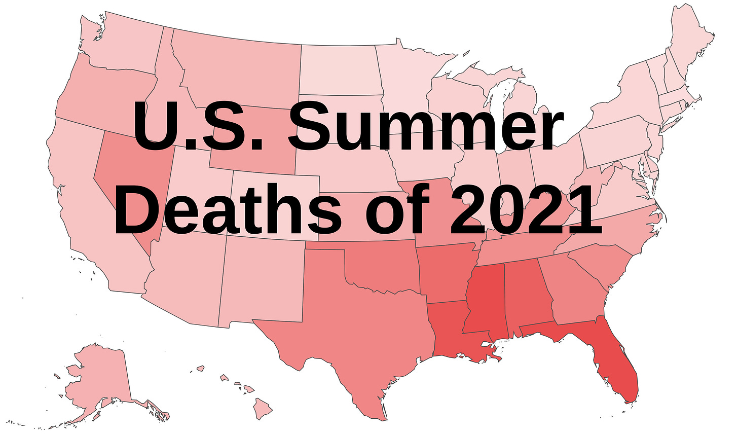

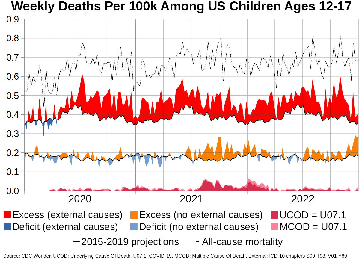

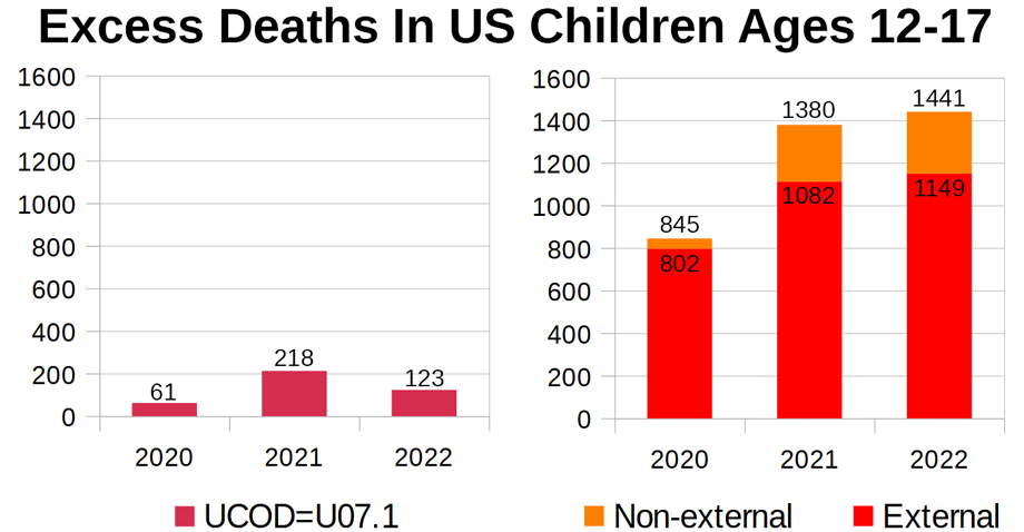
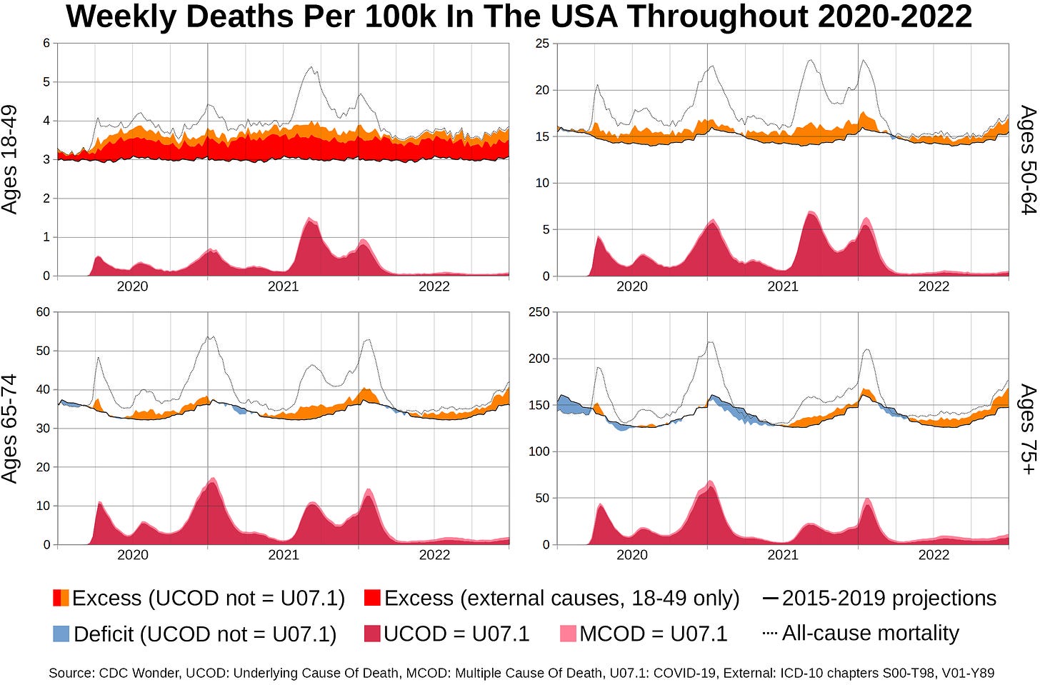


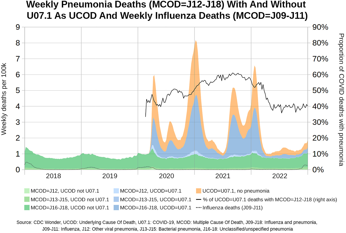


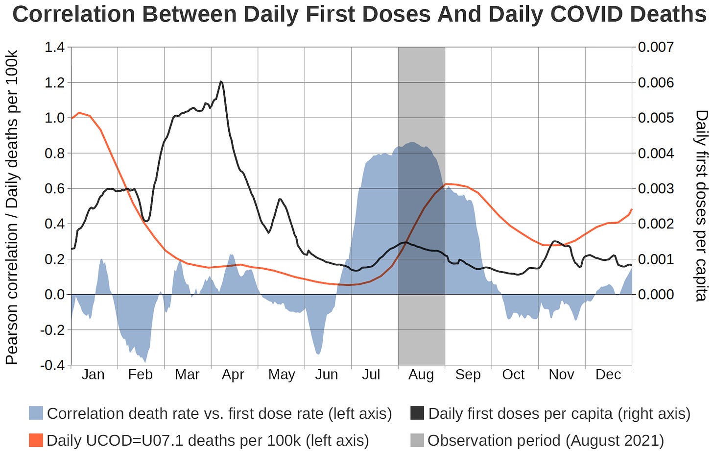

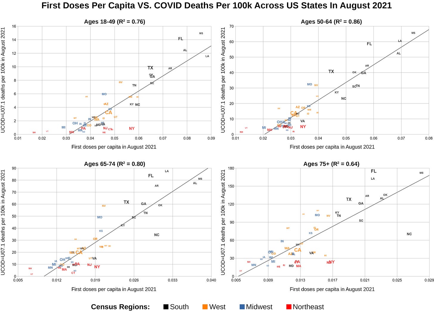

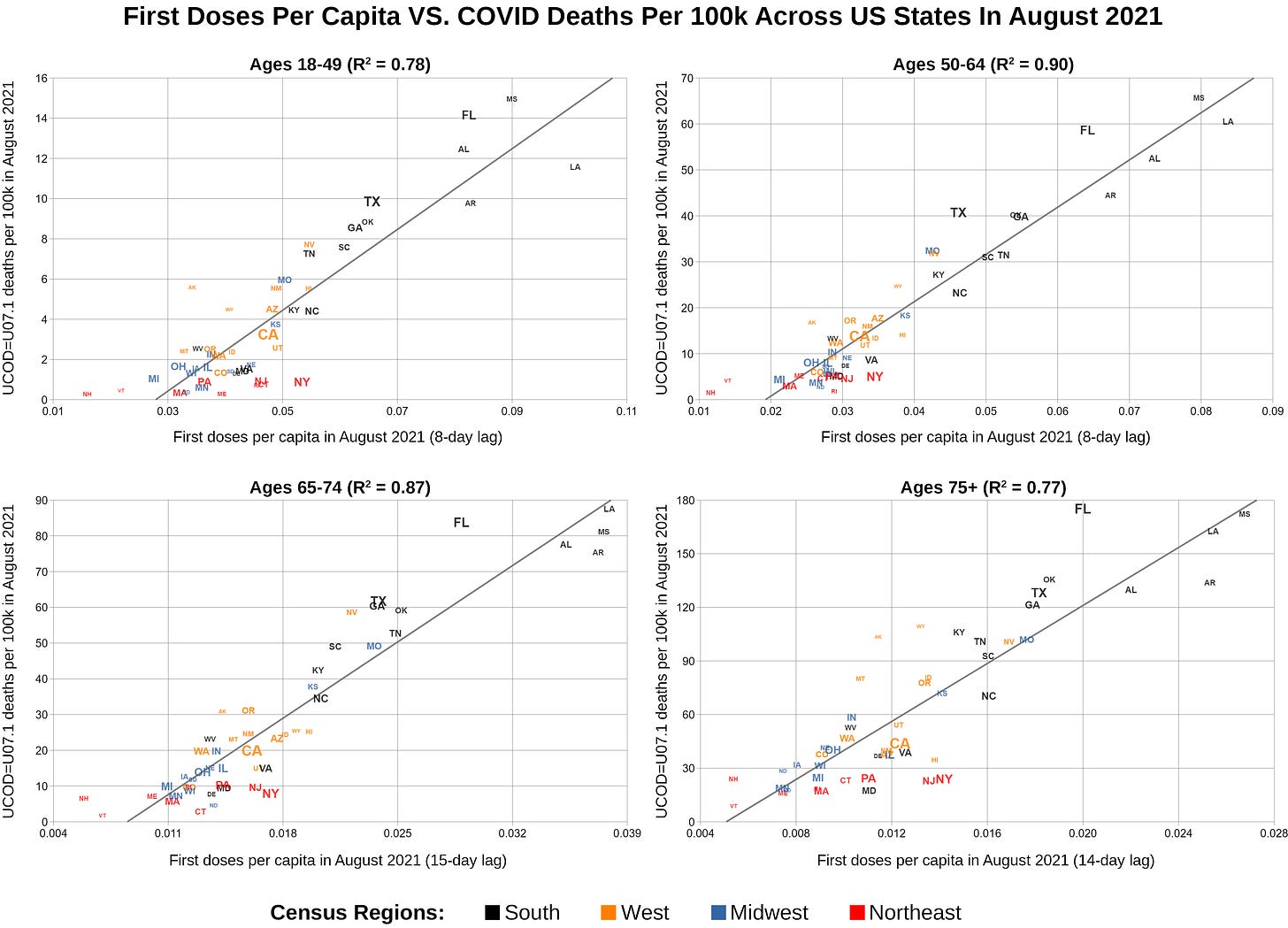
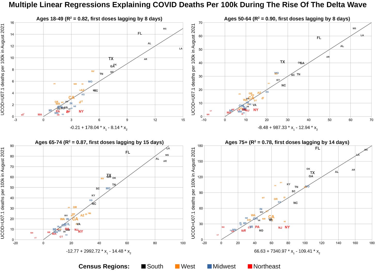
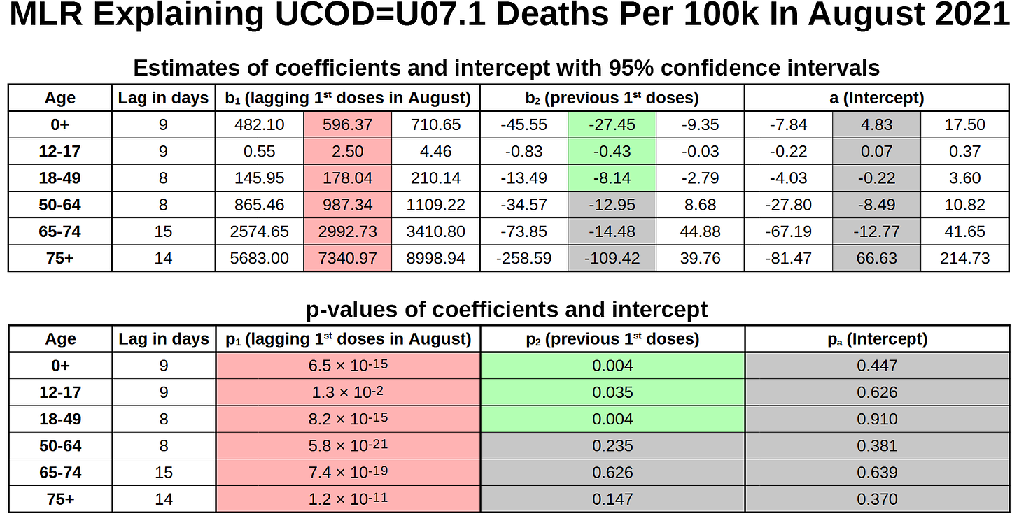
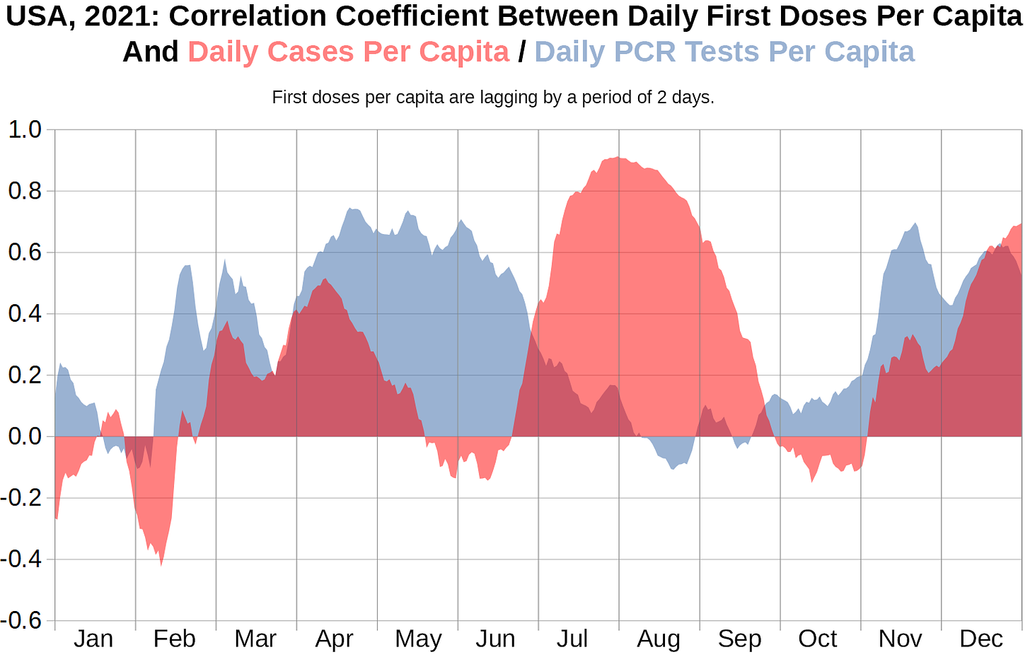

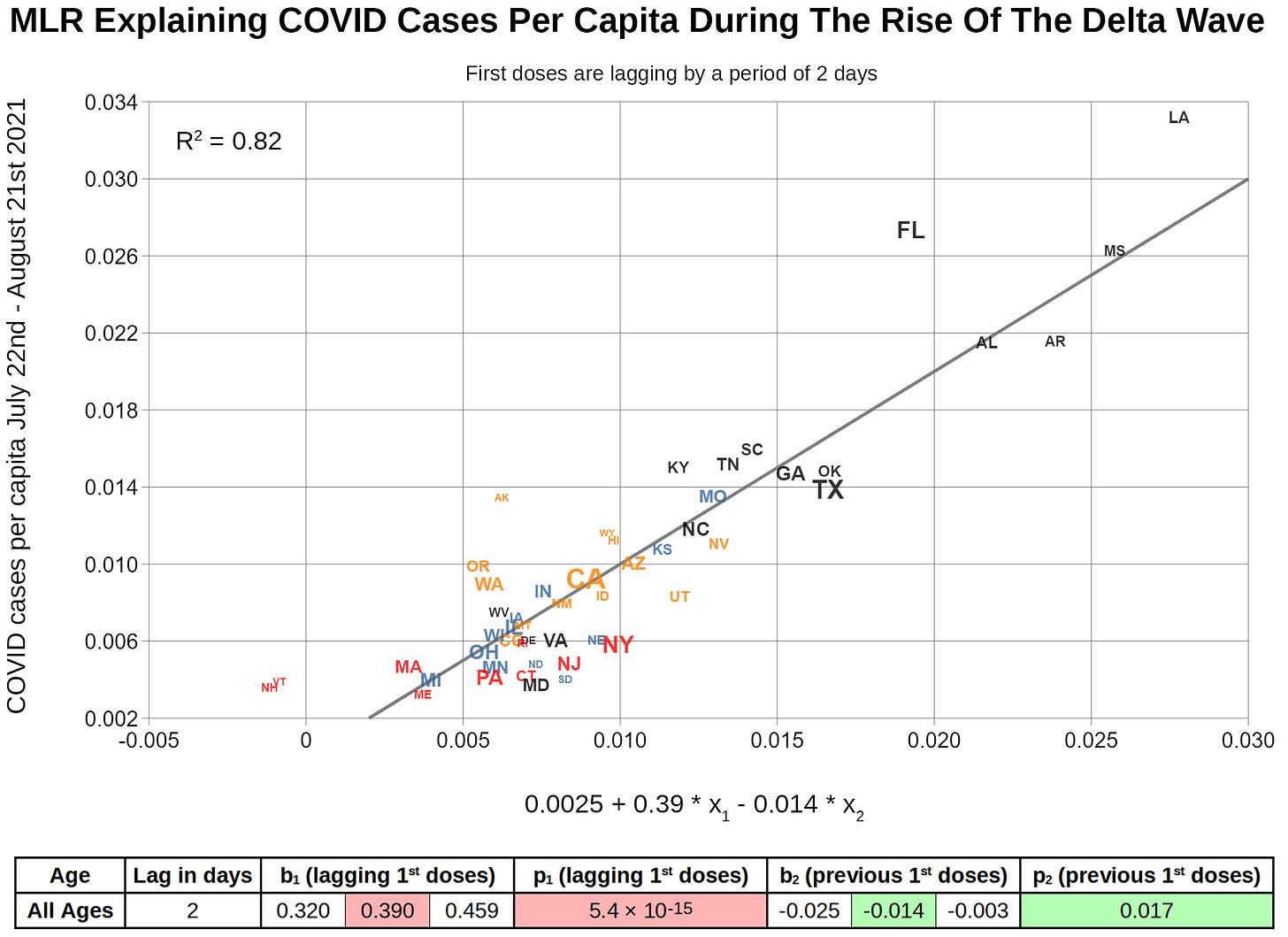

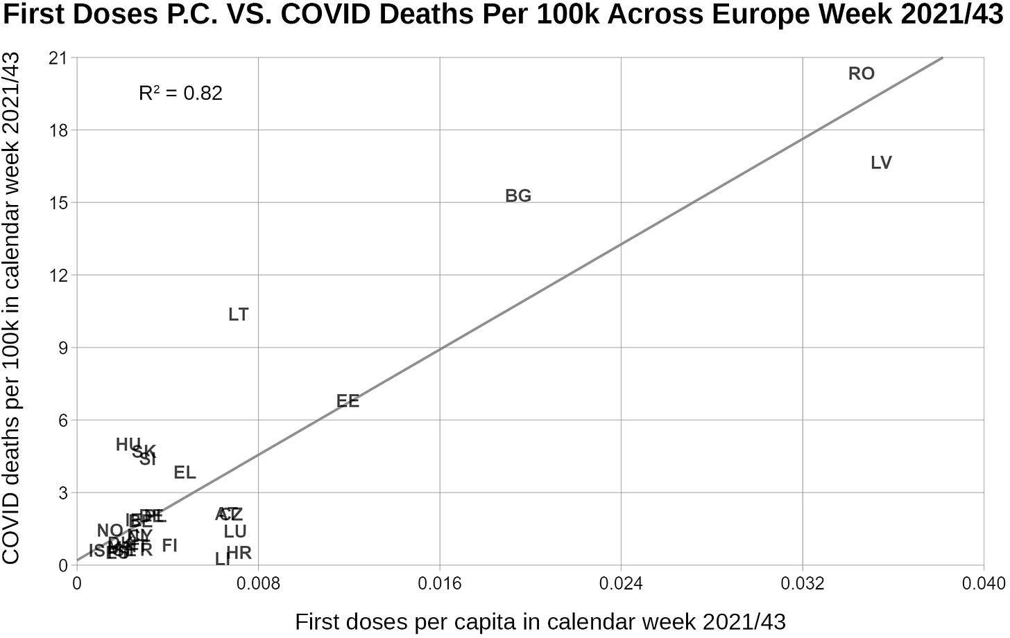

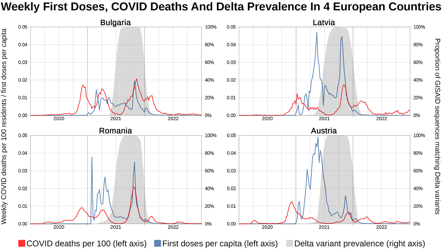
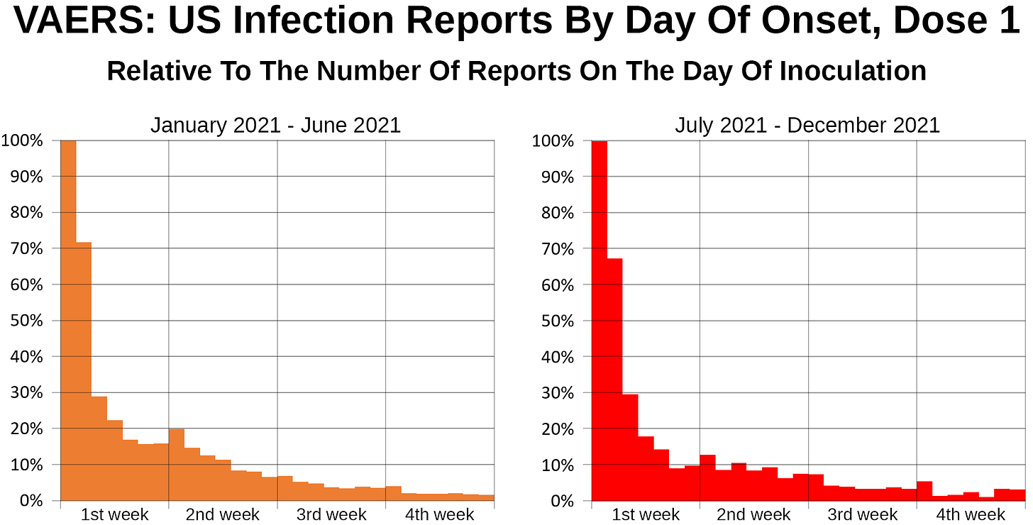

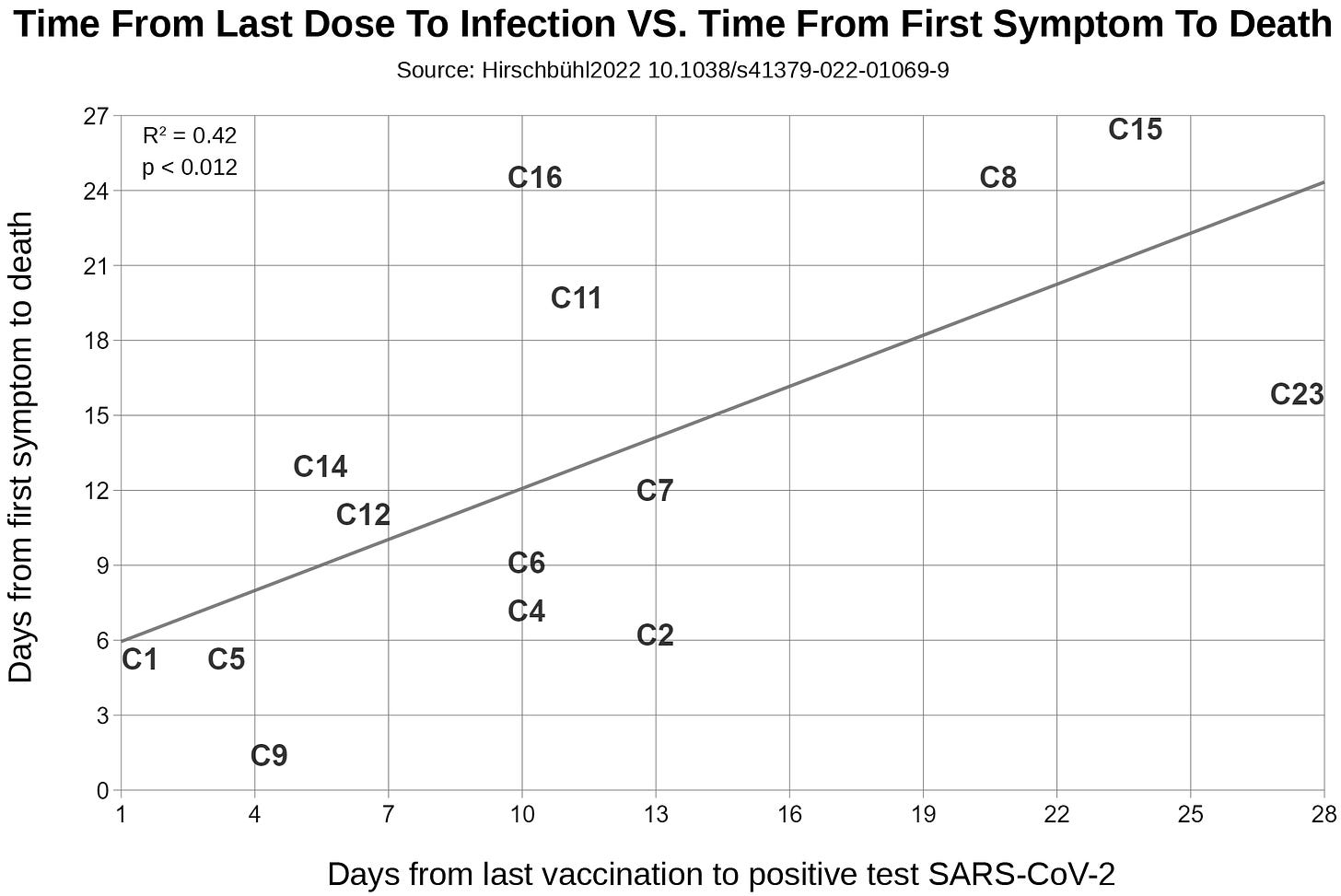


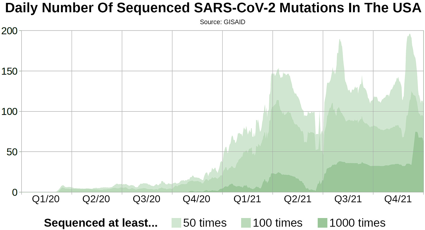
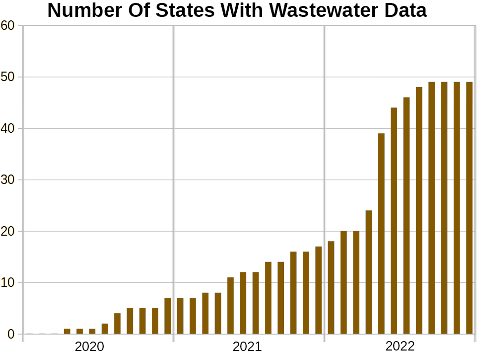

Thank you so much for all the effort and time you put into this.
wow, impressive effort! congratulations