Minnesota: Places Of Death
Just The Charts
Introduction
This morning I received an email from someone who suffers the delusion that the US excess mortality of 2021 and 2022 could be explained by an “epidemic of sudden deaths”.
I decided to create a few charts to establish that while these sudden deaths have apparently become more frequent, they do not nearly explain the millions of excess deaths we see across the USA.
Methods
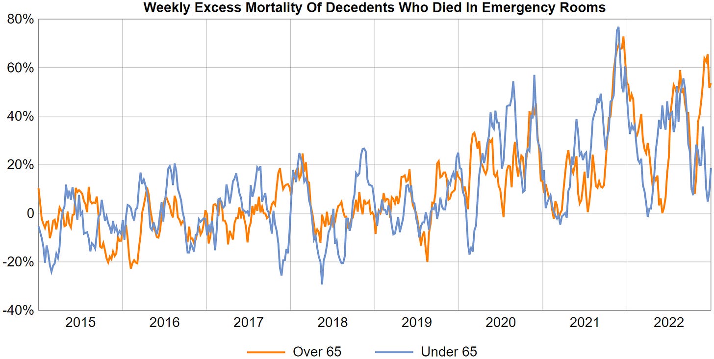
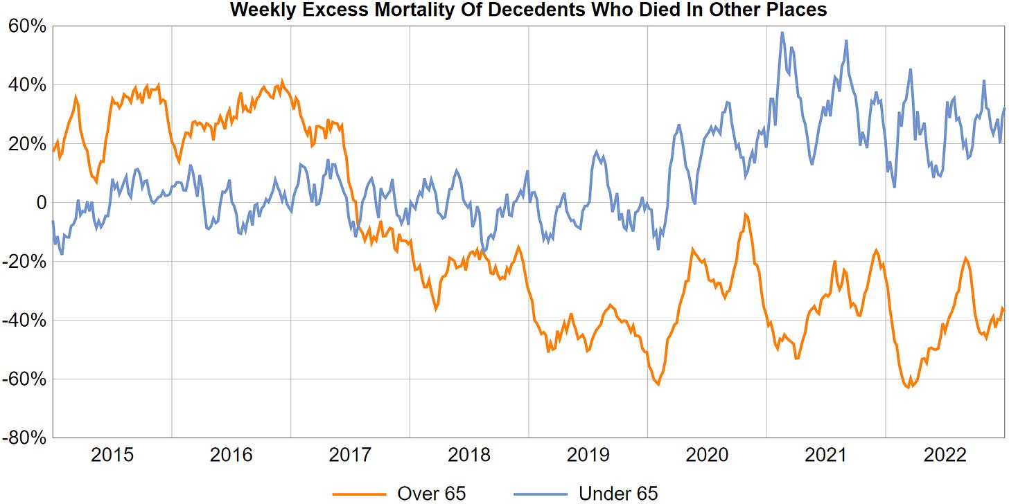
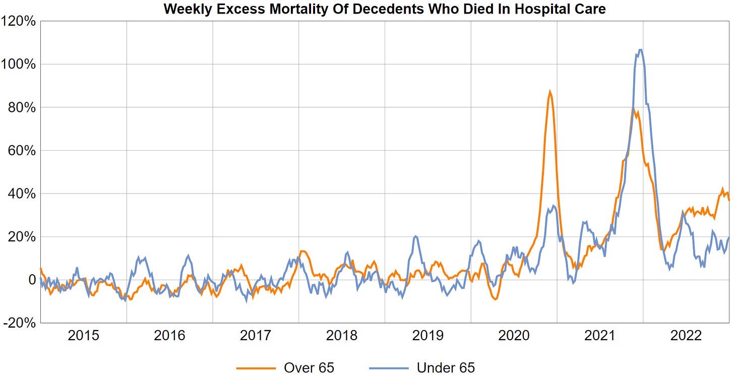
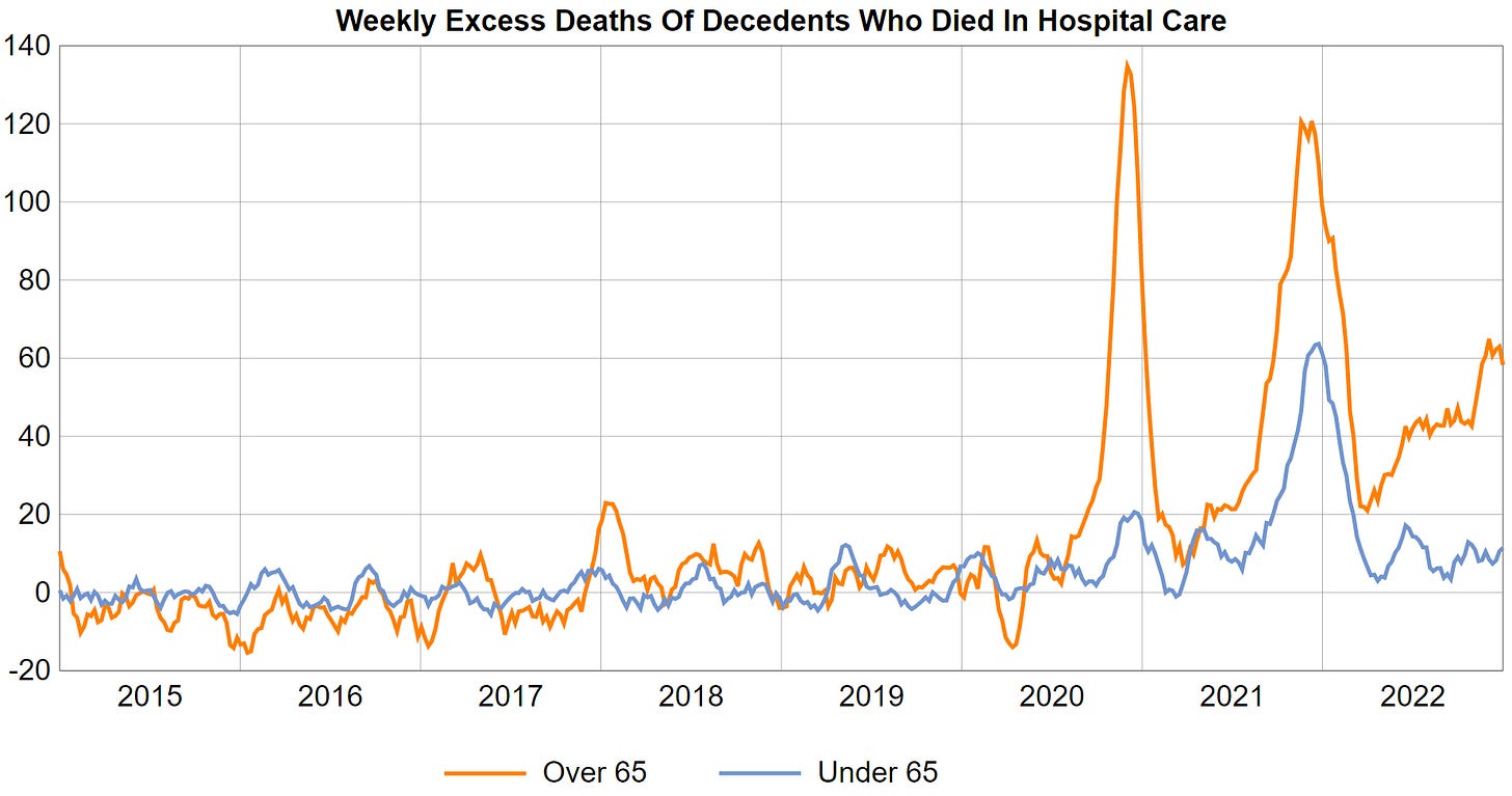
I am going to to leave all the thinking to you and will only display 2x6 charts representing weekly excess deaths and weekly excess mortality respectively for two age groups each, based on Minnesota death certificates of the years 2015 through 2018.
Each chart displays
either weekly relative excess mortality
or weekly absolute excess deaths,
contains two line graphs representing
deaths of individuals 65 and older
deaths of individuals under 65
and features only deaths occurring in one of 6 types of locations:
Hospital Care (inpatients of hospitals)
Emergency Room (either dead on arrival or emergency room)
Home (either the decedent’s home or a relative’s home)
Hospice
Nursing Home
Other (any other location, mostly outdoors)
Results
Conclusion
The situation is far more complex than some people would like you to believe. Don’t trust analysts who are cashing in on the situation by publishing books with sensationalist titles - not even if they’ve worked for Blackrock.


I'm sure this is a stupid question but what is the difference between excess death and excess mortality?
Heard a SelectQuote Life Insurance radio ad. They see it.
Woman voice actor says her relative "died suddenly" and going from there so it will catch the ear of the listener who will hopefully think ... oh, that's like me, they understand me, I'll call them.
Obviously they are seeing high "died suddenly" numbers to leverage in marketing.
The extra deaths are critically important of course but folks, I'm grinding an odd axe, that we also need to consider a little bit more what's beyond the glaring lights in our face i.e. the deaths. It would take 80 million dead bodies to be back to last year's world population on today's date so if it is depop by direct kill, so far they're pretty poor at it. Time bomb? Perhaps. You decide.
On the other hand, or additionally, what if they're smart and said hey, we don't have to kill anyone directly, all we have to do is reduce baby count. And they saw the mammal immunocontraceptives with stellar reputations for 20 years on over 80 mammals successfully sterilizing them and called it good. Then roops well crud, it turns out those mammals weren't on pharma drugs and sugar substitutes and caffeine and whatever else might be throwing a wrench into the works causing some human mammals to die suddenly and making the plan look bad. I'm referring to pzp and gonacon, the brontosaurus in the room no one can see.
Feels at times as if I have special glasses like in They Live.